Laying the Foundation: The Role of Logos in the Construction Industry
Imagine a world where words are scarce, and visuals reign supreme. In this world, your construction company's logo is the silent ambassador of your brand. It's more than just an aesthetic element; it's a powerful tool that shapes how your target audience perceives your business. This is the world of the construction industry, where a logo can build or break your brand's reputation.
What does a logo represent, you ask? It's the embodiment of your company's values, mission, and unique selling proposition. A well-crafted construction logo design can convey strength, reliability, and professionalism - essential traits in the construction industry. But what makes a good logo? And what should a logo include to effectively represent your brand?
In this blog post, we'll delve deep into the impact of logo design on brand perception, specifically in the construction sector. We'll explore the elements of a compelling construction logo and how it can elevate your brand's image. We'll also share insights from our design experts at Foresight Creative, a leading design agency renowned for creating modern, minimalist, and vintage logo designs. With our wealth of experience across various industries, including construction, we're well-equipped to guide you in crafting a logo that not only stands out but also truly represents your brand.
Whether you're a budding construction business looking to create a new logo or an established company considering a rebrand, this post is for you. Let's embark on this journey to understand the power and impact of logo design in shaping brand perception in the construction industry.
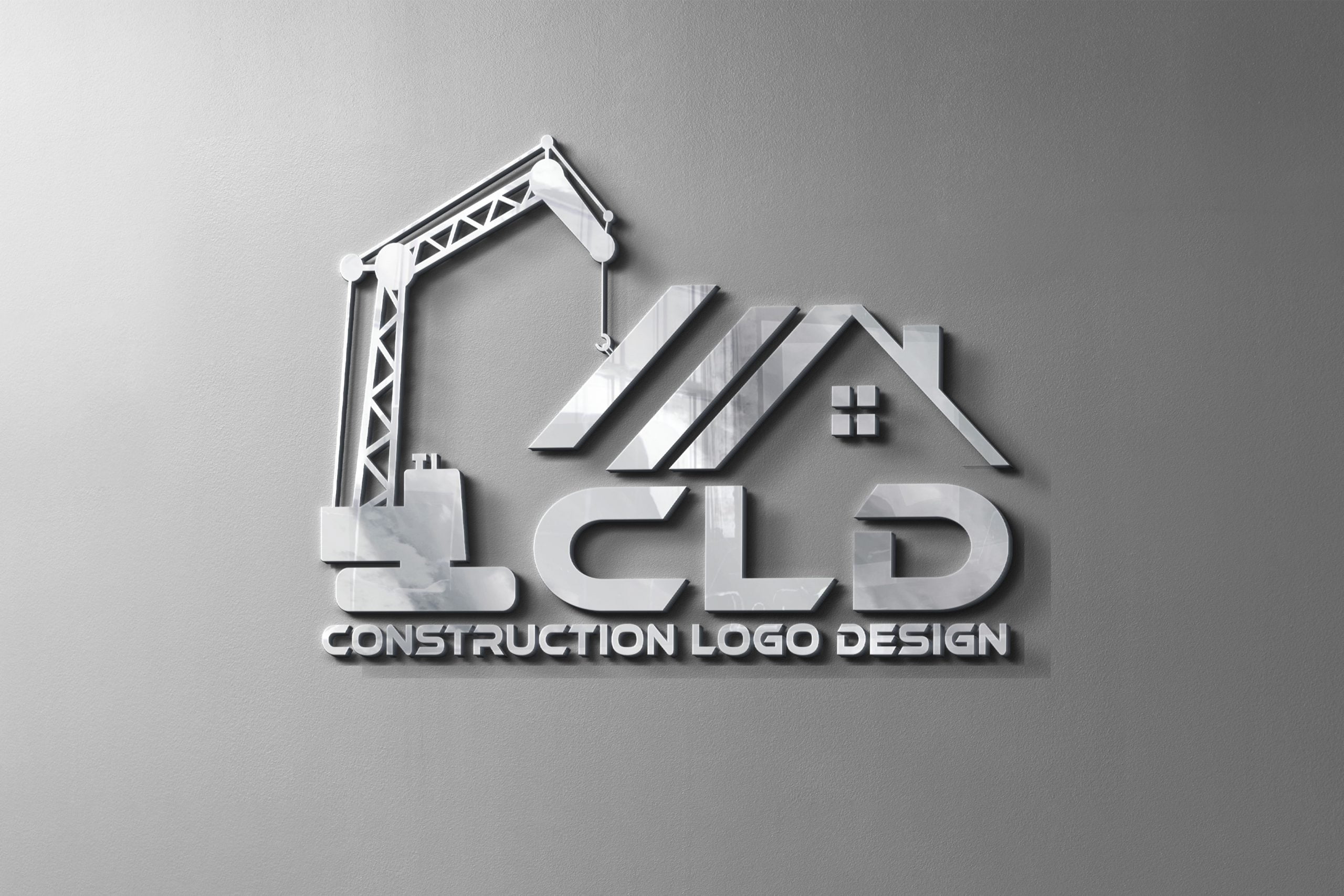
Branding Bricks: The Mighty Influence of Logos in Construction
Imagine a world where every construction company had the same logo. Would you be able to distinguish one from another? Likely not. This highlights the crucial role of a unique construction logo design in setting a brand apart. A logo is not merely a decorative element. It's a powerful marketing tool that encapsulates the essence of your brand, making it instantly recognizable to your target audience. If you're wondering whether Foresight Creative can design a logo for your construction company, check out our FAQ section.
When you see a crane in a logo, what comes to your mind? Strength, stability, and construction, right? That's the power of a well-designed logo. It communicates your brand's values and services without uttering a single word. It's a silent ambassador of your brand, working tirelessly to etch your brand's image in the minds of your audience. This is why distinctive logo designs are crucial for industries like trucking and construction.
Consider the impact of logo design on brand perception. A poorly designed logo may convey a lack of professionalism or attention to detail, while a well-designed logo can evoke feelings of trust and reliability. It's not just about aesthetics; it's about the message it sends to your potential clients. What does your logo represent? Does it align with the values and services your construction company offers? If not, it might be time for a redesign. For more insights on creating appealing and effective logo designs, check out our strategies.
At Foresight Creative, we understand the importance of logos for the construction business. We've seen first-hand how a compelling logo can transform a brand's perception and recognition. Whether it's a minimalist design or a 3D logo, we're masters at creating logos that not only look good but also tell a compelling story about your brand. So, what makes a good logo? And more importantly, what should a logo include to make an impact in the construction industry? Let's delve deeper.
Correlation Between Construction Logo Design and Brand Recognition
Blueprints for Success: Key Components of a Powerful Construction Logo
What makes a construction logo stand out? Is it the bold color, the crisp typography, or the striking imagery? The answer is all three. A compelling construction logo design is a harmonious blend of these elements, each playing a crucial role in shaping brand perception.
Color is the first element that catches the eye. It sets the mood and communicates the brand's personality. For instance, blue often signifies trust and reliability, vital traits in the construction industry. On the other hand, black represents strength and sophistication, while green could suggest eco-friendliness. For more insights on color selection, you can check out this guide on choosing a color palette for your brand or logo.
Next, we have typography. The font you choose can speak volumes about your construction company. Serif fonts suggest tradition and respectability, while sans-serif fonts convey modernity and efficiency. The key is to choose a font that aligns with your brand's identity and is legible across various mediums.
Lastly, imagery forms the heart of your construction logo design. Whether it's a minimalist silhouette of a skyscraper, a detailed illustration of a hard hat, or a geometric pattern representing bricks, the image should be unique and memorable. It should encapsulate what your construction business does and what it stands for. For instance, a hat logo design could symbolize the hard work and craftsmanship inherent in the construction industry.
Remember, your construction logo is more than just a pretty picture. It's a powerful tool that can shape how clients perceive your brand. So, does your logo accurately represent your construction company's values and services? If not, it might be time for a redesign, considering whether a 3D or circular style might better suit your brand.
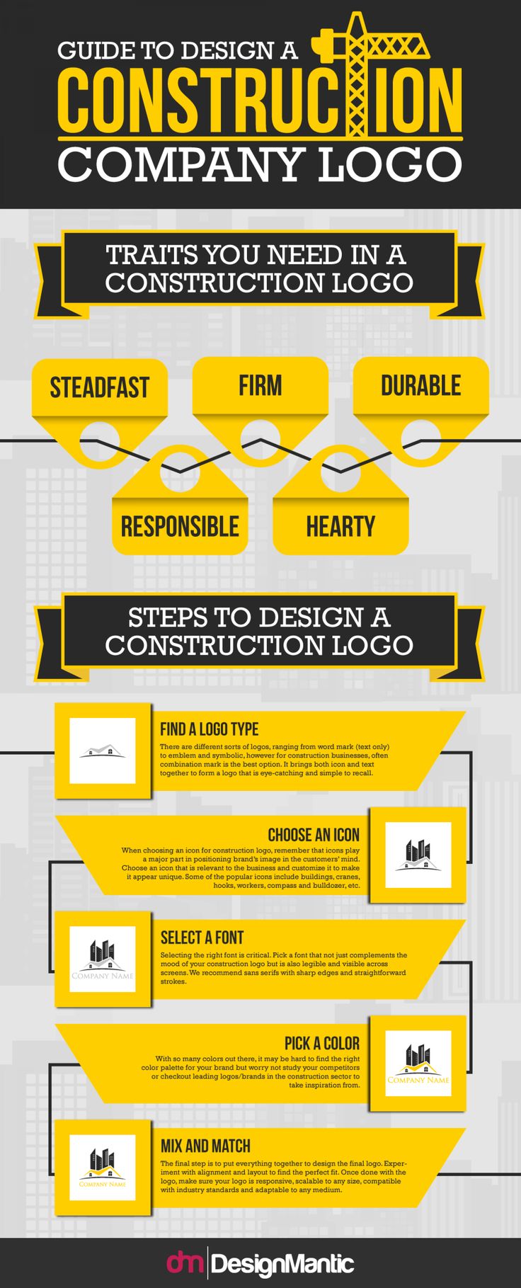
Building Impressions: Case Studies of Memorable Construction Logos
Let's delve into the world of successful construction logo designs and their impact on brand perception. We'll start with the iconic Caterpillar Inc. logo. With its bold, yellow trademark, it's a testament to the power of simplicity and color in a logo. The yellow hue is not only eye-catching but also symbolizes safety in the construction industry. It's a perfect example of how a logo can embody a company's values and industry. If you're interested in how color and simplicity can impact a logo, you might find this article on the psychology of color in brand identity logos enlightening.
Next, let's consider the Bechtel Corporation logo. The blue and white color scheme, coupled with the sturdy, block-like typography, conveys a sense of trustworthiness and reliability. This logo is a testament to the impact of typography in logo design. The choice of font can subtly communicate your brand's personality and values to your audience. For more insights on how to choose the right typography for your brand, check out this FAQ on choosing the right color palette and typography for a brand.
Lastly, let's look at the Vinci Construction logo. The minimalist design, featuring a stylized 'V', is sleek and modern, appealing to a contemporary audience. This logo demonstrates how a simple, clean design can make a strong and lasting impression. It's a reminder that sometimes, less is more. If you're curious about minimalist logos, you might want to read this FAQ on what a minimalist logo is.
These case studies show that a well-designed logo can significantly influence how a brand is perceived. It can communicate a company's values, appeal to its target audience, and ultimately, shape its brand image. So, what does your construction logo say about your brand? Remember, a logo is more than just an image; it's a powerful tool that can help build your brand from the ground up. If you're considering a professional logo design for your brand, you might find this FAQ on how to choose a design agency helpful.
Impactful Construction Logo Designs Quiz
Test your knowledge on the case studies discussed in the article 'Building from the Ground Up: How Construction Logo Designs Impact Brand Perception'.
Learn more about 🏗️ Impactful Construction Logo Designs Quiz or discover other Foresight Creative quizzes.
Architecting Identity: Practical Tips for a Robust Construction Logo
Creating a powerful and effective construction logo is no small feat. It requires a deep understanding of your brand and the message you want to convey. So, what makes a good logo? What should a logo include? Let's delve into the nitty-gritty of construction logo design.
Firstly, simplicity is key. A good construction logo should be easy to understand at a glance. Avoid cluttering your design with unnecessary elements. Instead, focus on a single, impactful image that encapsulates your brand's identity. This could be a stylized tool, a building silhouette, or even an abstract shape that communicates strength and stability. If you're considering a minimalist approach, you might find our FAQ on minimalist logos useful.
Next, consider your color choices carefully. Colors can evoke emotions and associations, so choose a palette that aligns with your brand's values. For instance, blues and grays can suggest reliability and professionalism, while earth tones might communicate a commitment to sustainable construction practices.
Typography is another crucial element. Opt for clear, readable fonts that reflect your brand's character. A bold, blocky typeface might be perfect for a construction company that specializes in large-scale projects, while a sleek, modern font could suit a firm with a focus on innovative design.
Lastly, remember that your logo will represent your brand across various platforms. It should be scalable and versatile, looking equally good on a business card, a billboard, or a website. A well-designed construction logo can be a powerful tool in shaping brand perception, so take the time to get it right. After all, your logo is more than just a pretty picture - it's the face of your brand. If you're looking for ideas, check out our suggestions for modern logo designs.
Practical Tips for Creating a Strong Construction Logo
- Keep it Simple: Less is more when it comes to logo design. Avoid clutter and focus on a single, impactful image that represents your brand's identity. This could be a stylized tool, a building silhouette, or an abstract shape.
- Color Matters: Colors evoke emotions and associations. Choose a palette that aligns with your brand's values. Blues and grays suggest reliability and professionalism, while earth tones may communicate a commitment to sustainable construction.
- Choose the Right Typography: Clear, readable fonts that reflect your brand's character are crucial. A bold, blocky typeface might be perfect for large-scale projects, while a sleek, modern font could suit a firm with a focus on innovative design.
- Consider Versatility: Your logo will represent your brand across various platforms. Ensure it is scalable and versatile, looking equally good on a business card, a billboard, or a website.
- Reflect Your Brand's Identity: Your logo should encapsulate your brand's identity. Whether you're all about strength and stability or innovation and creativity, make sure your logo communicates this.
- Take Your Time: A well-designed construction logo can be a powerful tool in shaping brand perception. Don't rush the process; take the time to get it right.
Final Thoughts: Cementing Your Brand Perception with a Strong Logo
As we've journeyed through the world of construction logo design, it's clear that a logo is more than just a simple emblem. It's the cornerstone of your brand perception, a visual cue that tells a story about your company's culture, ethos, and values. A well-crafted construction logo can be a powerful tool in your branding arsenal, helping you to stand out in a crowded marketplace, foster customer loyalty, and ultimately, drive business growth.
Remember, a logo is not merely an aesthetic choice. It's a strategic decision that can have a profound impact on how your construction business is perceived. So, what does your logo say about you? Does it showcase your brand's strength, reliability, and commitment to quality? Does it resonate with your target audience and set you apart from your competitors?
Whether you're starting a new construction business or looking to rebrand, the insights and tips shared in this post can guide you in creating a logo that truly represents your brand. From color and typography to imagery, every element matters. So, take your time, experiment, and don't be afraid to think outside the box.
At Foresight Creative, we specialize in creating compelling logos that not only look good but also work hard for your business. We understand the unique needs of the construction industry and can help you design a logo that captures the essence of your brand. If you're wondering how to create a modern logo for your business, why not take the first step towards building a stronger brand perception today?



No comments yet. Be the first to share your thoughts!