
In the world of finance, where trust and professionalism are the currency of choice, a well-crafted logo is more than just a visual mark; it's a declaration of your firm’s credibility. Crafting a money logo for financial firms is an intricate balance between aesthetic appeal and strategic design. It's about creating an emblem that not only stands out in the crowded marketplace but also resonates with the core values of fiscal responsibility and growth.
The Genesis of Money Logo Design
At the heart of every memorable money logo lies a story—a narrative that encapsulates the ethos of the financial firm it represents. The journey begins with understanding the brand's unique identity and how it wants to be perceived in the industry. Is it conservative and reliable or innovative and dynamic? This initial phase is crucial as it lays down the foundation for a logo that not only looks good but also aligns perfectly with the brand's messaging.
Identifying Brand Identity Through Logos
Test your knowledge on how well you can identify brand identity through the logos of financial firms. A strong logo can make a brand memorable and convey a firm's values and services. Let's see if you can match these logos with their strategic design concepts!
Color Psychology in Money Logo Design
The palette chosen for a money logo goes beyond mere decoration; colors have the power to evoke emotions and convey messages without words. Green often symbolizes growth and prosperity, making it a popular choice in financial logos. Blue exudes trustworthiness and professionalism, while gold can signify wealth and luxury. Understanding color psychology is pivotal in selecting hues that will subconsciously influence your potential clients' perception of your firm.
Color Preferences in Financial Logo Design
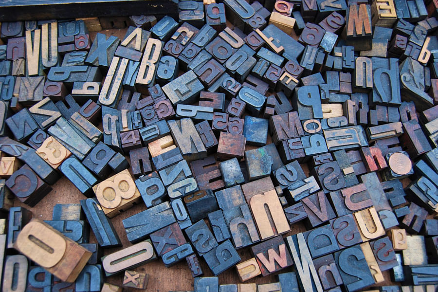
Typography That Speaks Volumes
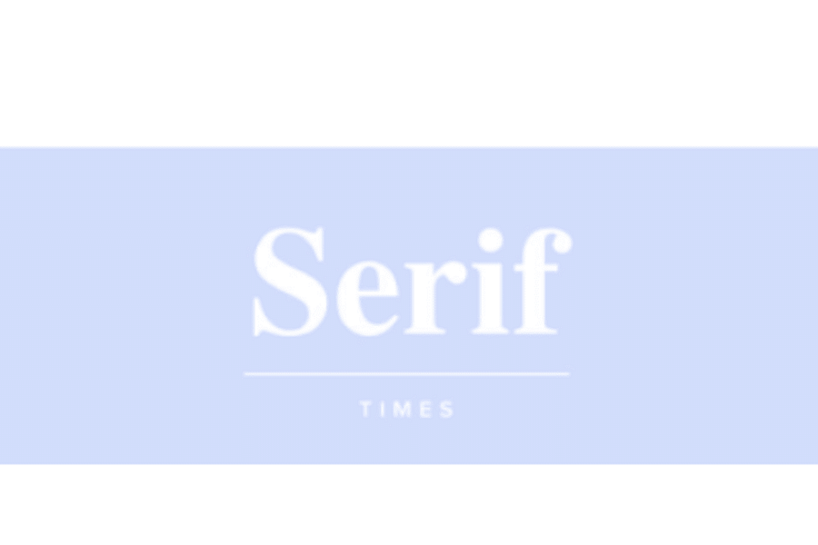
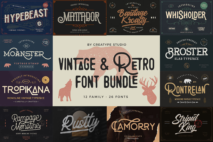
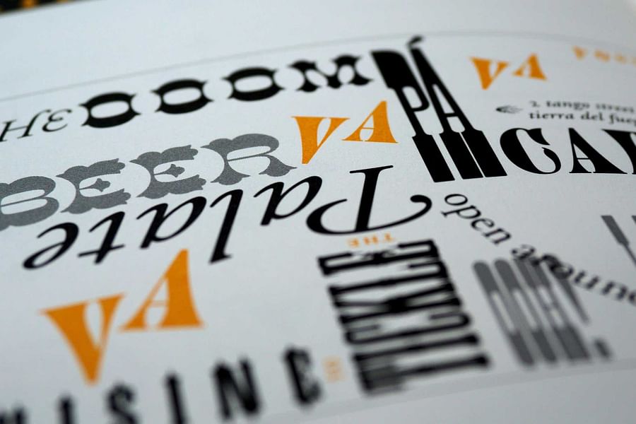
Selecting the right typeface is another strategic step in designing an effective money logo. The font should be legible across various mediums yet distinctive enough to set your brand apart. Serif fonts often reflect stability and respectability, which are key attributes for any financial institution. On the flip side, sans-serif fonts can project modernity and approachability—ideal for firms aiming to disrupt traditional markets.
Typography in Logos
- Serif Sophistication - Exuding tradition and reliability with a classic touch.
- Sans-Serif Modernity - Sleek and clean, signaling a modern and forward-thinking approach.

- Script Elegance - Artistic and personal, for brands that want to convey bespoke services.
- Slab Serif Stability - Conveys a sense of solidity and groundedness, perfect for instilling customer confidence.
- Modern Minimalist - Trendy and simplistic, appealing to the contemporary consumer.
- Handwritten Authenticity - Offers a personal touch that can make a brand feel more relatable and genuine.
- Geometric Precision - Represents accuracy and structure, ideal for firms emphasizing analytical prowess.
- Vintage Charm - A nod to the past, perfect for brands with a long history or retro appeal.
- Display Drama - Bold and attention-grabbing, for firms that want to make a strong impression.
- Custom Creativity - Unique and tailor-made, for businesses seeking a one-of-a-kind brand identity.
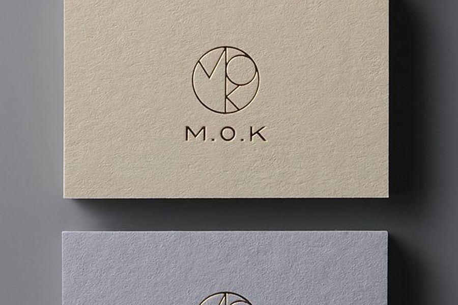
Incorporating Symbolism That Resonates
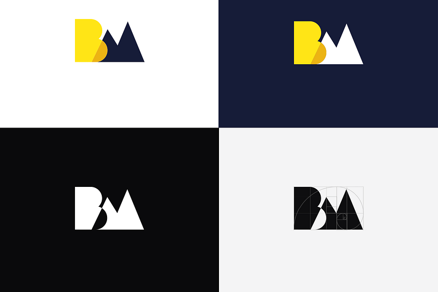
Symbols are powerful tools within logos as they can convey complex ideas succinctly. When integrating symbols into money logos, it's essential to choose imagery that reflects financial concepts such as security, growth, or wealth without being cliché or overly complex. An emblem like an eagle might represent freedom and vision—qualities that clients seek from their financial advisors—while geometric shapes like squares can denote stability and order.
To ensure your money logo carries its weight in gold, every element must be meticulously crafted—from choosing colors that communicate your brand’s values to selecting typography that speaks authority. A strategically designed logo not only captures attention but also instills confidence in your clients, assuring them that their finances are in capable hands.
Foresight Creative prides itself on creating designs that don't just follow trends; they set them. Our approach merges modern aesthetics with timeless principles to produce logos that stand out today and endure tomorrow. Whether you're looking to revamp an existing logo or create a new one from scratch, our team has the expertise to deliver designs that translate your company's essence into visual form.
To get started on crafting a logo that will elevate your financial firm's image while resonating with your target audience, use our handy logo design cost calculator. It will provide you with an estimate tailored to your specific needs so you can invest wisely in your brand’s future.
In our next section, we'll delve deeper into case studies showcasing successful money logo transformations and offer insights into how these changes have positively impacted those businesses' bottom lines. Stay tuned as we continue our exploration from concept to cash—where strategic design meets fiscal finesse.
Embodying Trust and Stability in Design
When it comes to the strategic design of money logos for financial firms, embodying a sense of trust and stability is paramount. These logos must reassure clients that their finances are in capable hands. To achieve this, designers often incorporate elements that symbolize strength and security, such as shields, vaults, or even the mighty oak tree. These symbols are not only visually appealing but also convey a subconscious message of reliability to anyone who views them.
Popularity and Trustworthiness of Financial Logo Symbols
Moreover, color plays a crucial role in logo design. It's well-documented that blue evokes feelings of professionalism and dependability—attributes that any financial firm would want to project. Green is another popular choice; it's not only associated with money but also signifies growth and prosperity. By carefully selecting colors that align with their brand values, financial firms can leverage their logos to create a lasting impression.
The Psychology of Colors in Financial Logo Design
Understanding the psychology behind color choices can be a powerful tool in logo design, especially for financial firms where trust and reliability are key. Take this quiz to test your knowledge on how colors can influence customer perception in the context of financial logos.
Innovative Typography That Speaks Volumes
The choice of typography in a money logo can speak volumes about the firm's approach to business. Traditional typefaces such as serif fonts may reflect a company's longstanding history and solid reputation. On the other hand, modern sans-serif fonts can suggest a forward-thinking and innovative mindset. But it's not just about choosing between serif or sans-serif; it's about crafting custom typefaces that are unique to the brand—a font that tells a story at first glance.
Top Fonts in Finance
- Prosperity Sans - A sleek, modern sans-serif that embodies stability and growth.

- Capital Serif - A robust, trustworthy typeface with timeless elegance for traditional firms.
- Venture Gothic - An adventurous, forward-thinking font that speaks to innovative financial services.
- Equity Script - A sophisticated script font that adds a personal touch to high-end investment branding.
- Ledger Lines - A clear and precise typeface that reflects accuracy and attention to detail.
- Monetary Mono - A contemporary monospaced font that suggests transparency and tech-savvy operations.

- Fiscal Finesse - A dynamic and versatile font that communicates expertise and agility in financial matters.
- Trust Type - A reliable and authoritative font that builds a sense of security and confidence.

- Bull Market Bold - An assertive and powerful typeface that captures the energy of the trading floor.

- Currency Curve - A fluid and elegant typeface that suggests movement and the flow of capital.

Typography should not only be readable but should also be adaptable across various media—from large billboards to mobile apps. In our ever-evolving digital age, scalability is key for maintaining brand consistency across all platforms.
The Power of Minimalism
In the world of finance where complexity is often the norm, minimalism in logo design can be a breath of fresh air. A minimalist approach strips away unnecessary frills, focusing on simplicity and clarity. This not only makes for an easily recognizable logo but also communicates efficiency and modernity—qualities that clients appreciate in an industry often bogged down by intricacies.
A minimalist design doesn't mean a lack of creativity; it requires an even higher level of ingenuity to convey powerful concepts with fewer elements. It's about finding the essence of the brand and representing it through clean lines, ample white space, and impactful imagery.
The journey from concept to cash involves more than just aesthetics; it requires strategic thinking and psychological insights into what makes people trust their financial advisors. By combining symbolism with color psychology, innovative typography, and minimalist principles, we at Foresight Creative craft logos that resonate with audiences while upholding the core values of financial firms.
Remember that your logo is often your first interaction with potential clients—it sets expectations and begins your story. Whether you're looking to revamp your existing identity or starting fresh, consider these elements carefully as they will define how your firm is perceived at first glance.
To delve deeper into creating compelling money logos for your firm or if you're curious about how different sports teams leverage money-themed logos, explore our comprehensive guides or take our quizzes to test your knowledge on sports money logos or color psychology in logo designs. And when you're ready to take the next step towards crafting your financial firm's visual identity, use our logo design cost calculator to get an estimate tailored specifically for your needs.
Your brand deserves more than just a logo—it deserves an emblem that encapsulates its ethos while appealing directly to its target audience’s needs and aspirations. At Foresight Creative, we don’t just design; we strategize to ensure that from concept to cash flow, every aspect of your visual identity works hard for you.


No comments yet. Be the first to share your thoughts!