
The Roots of Farming Identity: Tracing the Historical Significance
The logo, a company's visual handshake, has long served as a cornerstone of brand identity across industries. In the agricultural sector, logos not only represent the farm or business but also evoke a sense of heritage and connection to the earth. The evolution of farming logo designs is deeply entwined with the history of agriculture itself. Initially, farm logos were less about branding and more about marks of ownership, with simple symbols etched onto livestock or wooden crates to identify property.
As farming practices modernized, so did the need for a more sophisticated approach to branding. Logos began to incorporate elements that reflected the farm's specialty, whether it be dairy cattle silhouettes for a creamery or sheaves of wheat for a grain farm. This shift towards more purposeful design helped farms stand out in an increasingly competitive market.
Nurturing Growth: The Rise of Modern Farming Logos
In recent years, there has been a noticeable trend towards minimalism in logo design across various sectors. Agriculture is no exception. Today's farming logos often feature clean lines and simplified shapes that communicate efficiency and modernity. This minimalist approach not only aligns with current design trends but also translates well across digital platforms—a necessity in today's tech-driven marketplace.
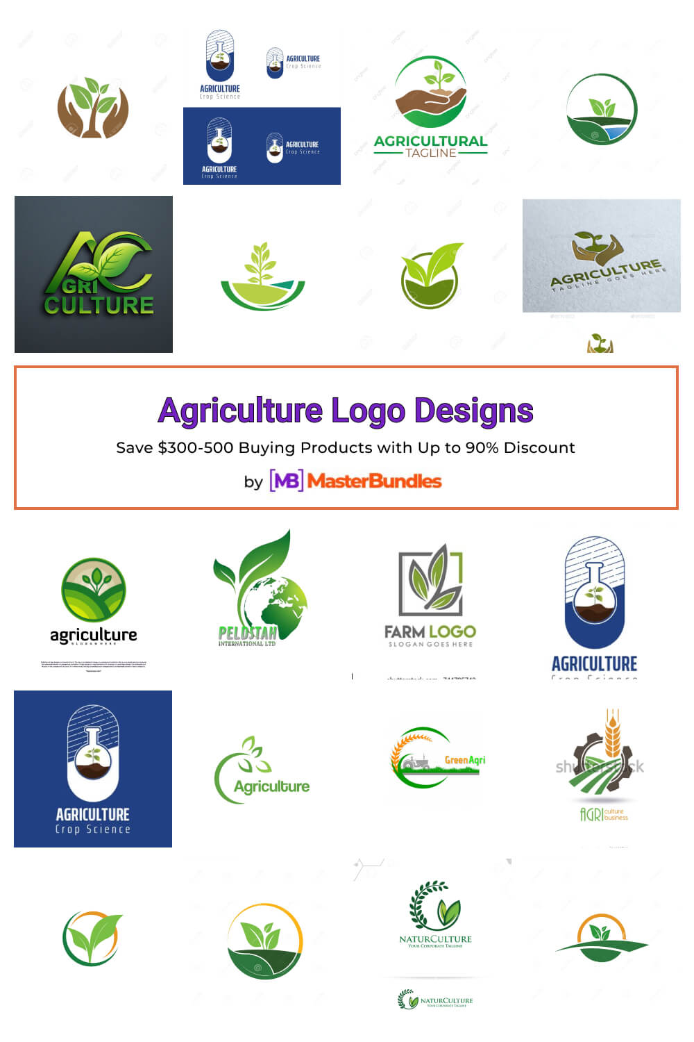
Minimalist Farm Logos
- Single-Line Wheat - A sleek, continuous line forming a wheat sheaf, embodying simplicity and growth.

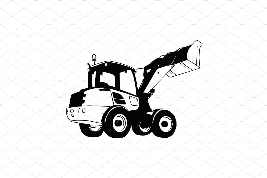
- Abstract Tractor - A geometric interpretation of a tractor, utilizing negative space for a modern touch.

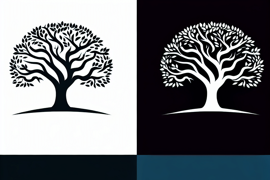
- Stylized Tree - A stylized tree with clean lines and a clear structure, representing life and stability.

- Monogram Farm - A monogram that combines the farm's initials in a sleek and elegant design.
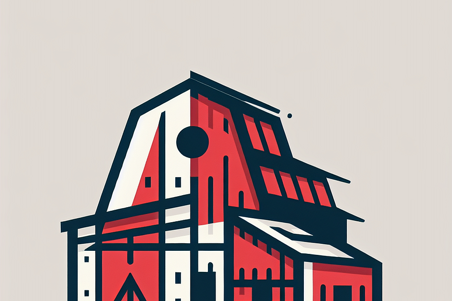
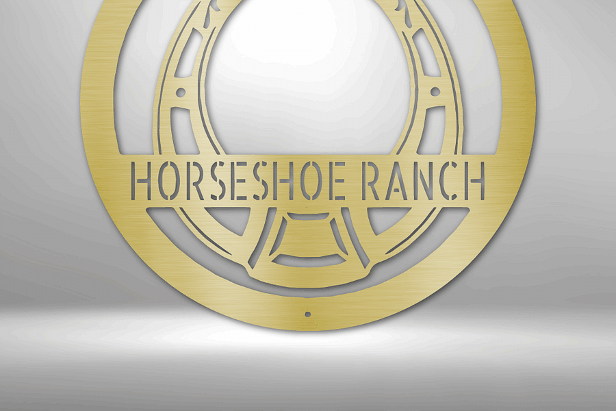
- Simplified Barn - A barn silhouette distilled to its simplest form, maintaining its iconic shape.

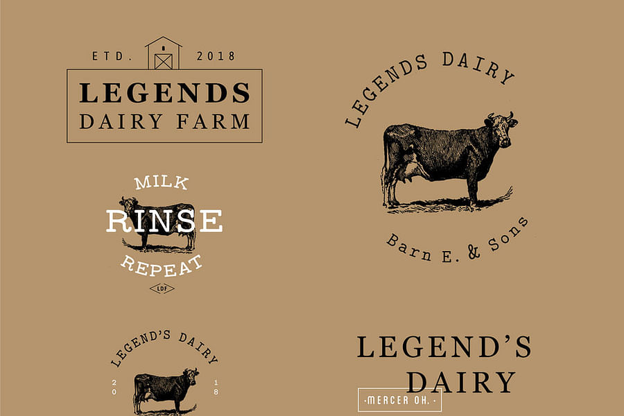
Moreover, as consumers become more invested in the origins of their food, there is a growing appreciation for vintage logo designs that harken back to traditional farming values. Such designs often incorporate rustic imagery or retro typography to convey authenticity and trustworthiness—qualities highly valued by today's discerning consumers.
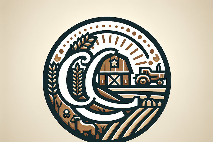
The Symbolism Behind Agricultural Emblems
Farm logo designs are rich with symbolism; every element from color choice to iconography can carry significant meaning. Green hues might speak to natural growth and sustainability, while an image of an oak tree could represent strength and endurance. Understanding these subtleties is crucial when crafting a logo that truly represents a farming business's ethos.
Prevalence of Symbols in Farming Logos and Their Meanings
It's not just about aesthetics; these symbols can also serve practical purposes. For example, certain icons may be chosen because they are easily recognizable at small sizes—important for packaging labels—or because they resonate well within the local community.
Custom Tailoring for Niche Markets
In addition to general agricultural businesses, niche markets within farming have emerged, each requiring tailored branding approaches. Organic farms might opt for earthy textures and colors in their logos to emphasize their commitment to natural processes. Wineries may incorporate elegant script fonts and grapevine motifs to suggest sophistication and tradition.
Foresight Creative specializes in understanding these nuances within different sectors of agriculture—from trucking logistics for produce distribution to fashion brands that source sustainable materials from farms. Our designs are not just visually appealing; they are strategic tools that help our clients communicate their unique stories and values.
To explore how Foresight Creative can craft a logo that encapsulates your farming business’s essence while staying on top of design trends, visit our page on whether Foresight Creative can design a logo for your farming business. And if you're curious about your knowledge on vintage designs, take our Vintage Logo Design Knowledge Test.
The contemporary era of farming logo design leans heavily on the principles of brand identity and visual storytelling. While traditional logos often depicted pastoral scenes or farm animals, modern agriculture businesses are choosing more abstract or stylized representations. This shift mirrors the evolution of the industry itself, which has become more technologically advanced and sustainability-focused. The logos now have to encapsulate these values while remaining distinct and memorable.
The Role of Color Psychology in Farming Logos
Color plays a pivotal role in logo design, invoking emotions and conveying messages without words. Green continues to dominate due to its association with growth, health, and nature—a perfect fit for the agriculture sector. However, there's a growing trend in using earth tones to represent organic and natural produce or bold colors like red to symbolize energy and passion for farming. Understanding these color implications is crucial for creating a logo that not only looks appealing but also communicates the right message.
Color Popularity and Psychological Impact in Modern Farming Logos
Incorporating Minimalism for Maximum Impact
Minimalism has taken center stage in various design disciplines, including logo creation for agriculture businesses. Simplified shapes, clean lines, and limited color palettes make these logos highly adaptable across different media—from product packaging to digital platforms. This design approach not only aligns with contemporary aesthetics but also ensures that logos are scalable and functional without losing their essence.
Minimalist Farm Logos
- Single-Line Wheat - A sleek, continuous line forming a wheat sheaf, conveying simplicity and growth.

- Tree Silhouette - Utilizes a clean, single-color tree icon to symbolize life and sustainability in agriculture.
- Sunrise Fields - A horizon line with rising sun above fields, representing a new dawn in eco-friendly farming.
- Abstract Barn - A geometric interpretation of a barn structure, focusing on form and space to create a modern farm identity.
- Leaf and Drop - A combination of a leaf and water drop, this logo encapsulates the essence of agriculture and irrigation.

- Stylized Tractor - An iconic, simplified tractor shape that communicates farming with a modern twist.
- Minimalist Cow - A line art representation of a cow, using negative space to define its features, ideal for dairy farms.
- Typographic Seedling - A creative use of typography where letters sprout leaves, blending the name of the farm with imagery of growth.
- Simple Fruit Icons - Clean and modern fruit shapes that can be used singularly or as a pattern for a produce-focused farm.
- Monogram Crest - A classic approach with initials of the farm encased in a crest, symbolizing heritage and quality.
Interactive Elements: Engaging Audiences with Your Brand
In an age where digital presence is indispensable, interactive elements in logo designs can significantly boost engagement. By incorporating features like hidden symbols or transformable components that invite viewers to take a closer look or interact with the logo, brands can create memorable experiences that resonate with their audience.
The Evolution of Farming Logos Quiz
How well can you identify the interactive elements in farming logos? Take this quiz to test your knowledge on the evolution of logo designs in agriculture.
Moreover, storytelling through logos can be greatly enhanced by interactivity. It allows brands to weave narratives about their heritage, practices, or community involvement directly into their visual identity. With each interaction, customers form deeper connections with the brand's story.
Embracing Vintage Aesthetics with a Modern Twist
Vintage-inspired logos have made a strong comeback in the farming industry as they evoke nostalgia and authenticity—qualities highly valued by consumers looking for trustworthy food sources. However, it's not just about replicating old designs; it's about reimagining them for today's context. By blending vintage elements with modern design principles, such as simplicity and readability, these logos offer a timeless appeal that stands out in a crowded market.
To further explore how vintage designs are influencing current trends in branding, consider how they can be adapted for your own farming business. The key is to strike the right balance between homage and innovation.
The Future of Farming Logo Design
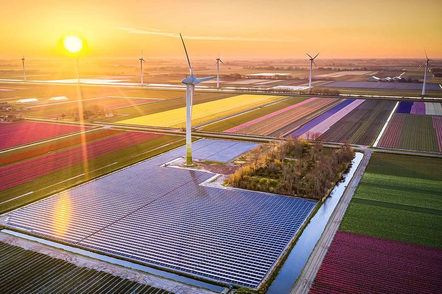
As we look towards the future, it's clear that sustainability will remain at the heart of agricultural branding. Logos will likely continue to evolve to reflect eco-friendly practices and advancements in agri-tech. We may see an increase in dynamic logos that change over time or according to context—symbolizing the ever-evolving nature of agriculture itself.
The importance of having a well-designed logo cannot be overstated—it is often the first point of contact between your business and potential customers. In agriculture especially—a sector where trustworthiness is paramount—a strong visual identity helps establish credibility and fosters brand loyalty. Whether you're starting from scratch or thinking about rebranding Foresight Creative can help you cultivate a powerful logo that grows alongside your business.
To stay ahead of trends while paying respect to tradition is no small feat; yet it is one that successful agricultural brands manage by constantly innovating their visual identities while keeping roots firmly planted in their heritage. As we continue witnessing this evolution unfold, one thing remains clear: effective farming logo designs are those that connect on an emotional level while also serving as a beacon of brand identity.

No comments yet. Be the first to share your thoughts!