


The minimalist shift in branding
Use this section to make the How Foresight Creative Shapes Logo Trends decision easier to compare in real life, not just on paper. Start with the reader's actual constraint, then separate must-have requirements from details that are merely nice to have. A practical choice should survive normal use, maintenance, timing, and budget. If a recommendation only works in an ideal situation, call that out plainly and give the reader a fallback path.
The simplest way to use this section is to write down the must-have criteria first, then compare each option against those criteria before weighing nice-to-have features.
Vintage aesthetics make a comeback
The push for hyper-modern minimalism has reached a saturation point. Brands are now turning backward to find forward momentum. This resurgence isn't about nostalgia for nostalgia's sake; it's a strategic move to build trust and authenticity. Consumers crave the tangible, the proven, and the human. Vintage aesthetics deliver that sense of permanence in a digital world that feels increasingly disposable.
Foresight Creative understands that heritage elements don't mean clutter. The firm specializes in distilling the soul of a brand's history into clean, contemporary forms. By stripping away the noise of mid-century design tropes, they preserve the emotional resonance of vintage styles while ensuring the logo functions perfectly on mobile screens and social media avatars.

This approach blends the warmth of retro typography with the precision of modern vector graphics. The result is a logo that feels familiar yet fresh. It signals that a brand has roots, but it is still growing. In 2026, this balance of old-world charm and new-world efficiency is the defining characteristic of successful visual identity.
Logos for construction and farming
Heavy industry demands visual languages that communicate durability and trust. When designing for construction and farming, the goal is to balance rugged reliability with modern clarity. We achieve this by blending minimalist geometry with vintage craftsmanship, ensuring the brand feels established without feeling outdated. This approach resonates with clients who value strength and longevity in their business identity.

Foresight Creative applies these principles through specific design choices that highlight structural integrity and agricultural heritage. The following examples illustrate how we adapt these trends for heavy industry clients.
Construction and farming logo applications
-
Geometric Steel Framework
We use clean, intersecting lines to represent structural beams and scaffolding. The sharp angles convey precision and engineering excellence, while a muted steel-gray palette reinforces industrial strength. -
Heritage Harvest Shield
This design merges a classic shield shape with subtle wheat stalk textures. The vintage aesthetic nods to agricultural tradition, while the simplified iconography ensures it scales well on heavy machinery and safety gear. -
Rugged Topography Mark
Using layered contour lines, we create a logo that suggests earth and foundation. The organic curves soften the harshness of construction, symbolizing both the land and the structures built upon it.
Fashion brands embrace modern simplicity
The fashion industry is currently shifting toward logos that feel both timeless and immediate. Designers are moving away from heavy, ornate branding in favor of minimalist structures that can withstand the rapid churn of social media feeds. This approach doesn't strip away character; instead, it refines it, allowing the brand's heritage to shine through clean lines and negative space.
Foresight Creative has identified this hybrid aesthetic as a strategic advantage. By blending vintage textures with contemporary typography, brands can signal authenticity without appearing dated. The result is a visual identity that feels grounded in history but ready for the digital age. This balance allows fashion houses to maintain prestige while remaining accessible to a new generation of consumers.
The key to this trend lies in restraint. A simplified logo reduces visual noise, making the brand instantly recognizable even at thumbnail size. When paired with subtle vintage elements—such as grain, serif details, or muted palettes—the logo gains depth and narrative weight. It becomes a mark of quality rather than just a label.
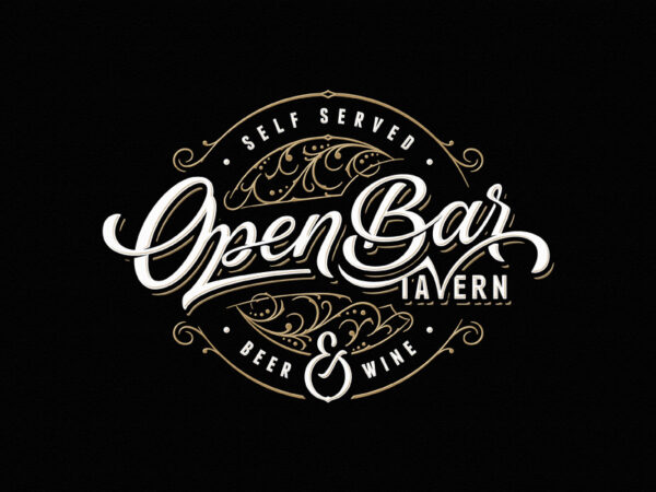
This direction prioritizes longevity over novelty. A minimalist-vintage hybrid logo is designed to age gracefully, avoiding the pitfalls of fleeting design fads. For fashion brands, this means building a visual asset that can evolve with the company while retaining its core identity. It is a strategy that values substance, ensuring the brand remains relevant as trends continue to shift.
Why Foresight Creative Leads 2026 Logo Trends
Foresight Creative stands apart by bridging the gap between abstract concept and tangible operation. Their approach to logo design doesn't just prioritize aesthetics; it integrates hospitality masterplanning and commercial strategy into every visual decision. This holistic method ensures that a 2026 logo trend isn't merely a stylistic choice but a functional business asset.
The studio’s visual-first methodology relies on high-quality imagery to test how designs perform in real-world contexts. By blending minimalist precision with vintage warmth, they create identities that feel both modern and timeless. This balance allows brands to manage the shifting landscapes of 2026 without losing their core identity.
Their expertise lies in anticipating how visual trends will interact with operational realities. Rather than reacting to fleeting fads, Foresight Creative shapes trends by grounding them in strategic foresight. This results in logos that are not only visually striking but also commercially viable and operationally sound.
No comments yet. Be the first to share your thoughts!