
Interiors are invading fashion
Fashion logos are getting quieter. The aggressive branding of the last decade is giving way to textures and spatial awareness usually reserved for living rooms. It isn't just a phase; brands are realizing that a logo should feel like a physical object in a room rather than a digital sticker.
For decades, fashion logos often leaned into maximalism. Think of the bold, logo-mania of the 80s and 90s. That era prioritized visibility above all else, a constant barrage of branding. But that approach now feels dated, even garish to many consumers. There’s a growing preference for brands that project a sense of quiet confidence, a feeling of quality that doesn’t need to be aggressively proclaimed.
This isn’t to say fashion logos are disappearing. Instead, they’re evolving. They're becoming more attuned to the sensibilities of a consumer who’s increasingly influenced by the curated spaces they inhabit. The home, after all, is the ultimate expression of personal style, and the principles of good interior design are starting to seep into the world of fashion.
Texture Over Typography
One of the most noticeable differences between the old and new guard of fashion logos is the increased emphasis on texture and materiality. Interior design is fundamentally about creating tactile experiences – the feel of a plush rug, the coolness of marble, the grain of wood. Fashion logos are beginning to mimic this, albeit in a visual sense.
We’re seeing more logos incorporating subtle gradients, embossed effects, and intricate patterns that mimic woven fabrics or natural surfaces. This moves away from the purely typographic approach that dominated for so long. It's about creating a visual experience that feels richer and more engaging.
This isn't about decoration. Texture makes a logo feel like a physical product. When a digital mark mimics the grain of oak or the weave of heavy linen, it stops being a symbol and starts being an object. You can almost feel the weight of it.
Earthy color palettes
The color palettes used in fashion logos are also undergoing a transformation. Historically, fashion brands favored bright, attention-grabbing colors – think the vibrant reds and electric blues of luxury brands. Now, there’s a distinct move towards more muted, earthy tones.
Beiges, creams, terracotta, olive green, and various shades of brown are becoming increasingly prevalent. These colors are staples in interior design, used to create calming, sophisticated, and inviting spaces. They evoke a sense of nature, tranquility, and understated luxury.
These tones suggest a brand cares about the physical world. Terracotta and olive green don't just look better on a screen; they bridge the gap between a retail space and a home. It’s a move toward colors that actually exist in nature.
Space and Negative Space
Interior designers are masters of space. They understand how to create flow, balance, and visual interest through the careful arrangement of objects and the strategic use of empty areas. This principle is now making its way into logo design.
We’re seeing more logos that utilize negative space effectively, creating a sense of airiness and sophistication. This contrasts sharply with the cluttered, information-dense logos of the past, which often felt overwhelming and intrusive. A logo with ample negative space feels more refined, more elegant, and more memorable.
The skillful use of negative space also conveys a sense of confidence. It suggests that the brand doesn’t need to fill every available inch with its logo to make an impact. It’s a subtle but powerful statement of self-assurance.
Animal Imagery: A Shared Language
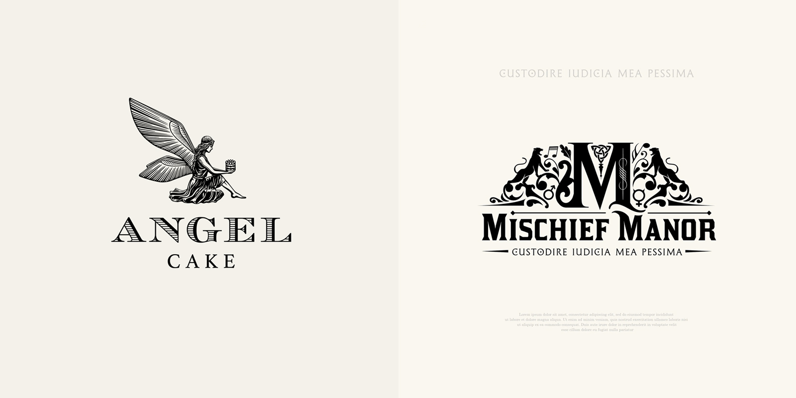
Both interior design and fashion frequently employ animal imagery, though rarely in a literal sense. It’s more about evoking the qualities associated with certain animals – the sleekness of a panther, the power of a lion, the elegance of a swan.
In interior design, you might see a rug with a subtle leopard print or a piece of art inspired by the plumage of a bird. In fashion, you might find a logo that subtly incorporates the texture of snakeskin or the pattern of zebra stripes. This imagery resonates on a subconscious level, tapping into primal instincts and archetypal associations.
Foresight Creative has extensive experience with animal-inspired logo design, creating logos that capture the essence of various creatures without resorting to cliché. We understand how to use animal imagery to convey specific brand values – strength, grace, luxury, or playfulness.
- Panthers for sleek power
- Birds for light movement
- Lions for heavy presence
Circular Logos: The Interior Design Echo
Circular logos are experiencing a surge in popularity, and I believe this is directly linked to the influence of interior design. Circular forms – rugs, mirrors, architectural elements – are ubiquitous in interior spaces, creating a sense of wholeness, harmony, and continuity.
Circular logos achieve a similar effect, conveying a sense of stability, completeness, and inclusivity. They feel less rigid and more approachable than logos with sharp angles or harsh lines. There’s a psychological comfort associated with circular shapes, a feeling of safety and protection.
We've designed a number of circular logos for clients recently, often incorporating subtle gradients or textures to further enhance the sense of depth and sophistication. The key is to avoid making the logo feel too static or predictable. It needs to be dynamic and engaging.
Animal Symbolism in Design
- Lion - Often representing courage, leadership, and royalty, the lion appears in both fashion (Versace’s Medusa head is inspired by a lion’s mane) and interior design (used in heraldic motifs and luxurious fabrics).
- Swan - Symbolizing grace, elegance, and transformation, swans are frequently used in ballet-inspired fashion collections and in interior design as decorative elements, particularly in Art Nouveau styles.
- Wolf - Representing loyalty, family, and wildness, wolves are gaining popularity in streetwear and outdoor apparel brands. In interior design, wolf imagery evokes a rustic, natural aesthetic.
- Eagle - A classic symbol of freedom, power, and vision, eagles are used in high-end fashion brands to convey prestige and are common in patriotic or Americana-themed interiors.
- Peacock - Signifying beauty, luxury, and immortality, peacocks are often featured in vibrant fashion prints and in opulent interior design schemes, particularly in maximalist styles.
- Snake - Representing transformation, healing, and temptation, snakes are utilized in avant-garde fashion designs (think Alexander McQueen) and can be found as decorative motifs in both modern and ancient interior styles.
- Butterfly - Symbolizing metamorphosis, hope, and beauty, butterflies are common in delicate, feminine fashion designs and are frequently incorporated into wallpaper and textile patterns in interior spaces.
The new rules for brands
So, what does all this mean for fashion brands? It’s not about abandoning branding altogether, or about suddenly adopting a minimalist aesthetic wholesale. It’s about recognizing that the rules have changed, and that consumers are looking for something different.
Brands need to embrace subtlety, texture, and a more holistic approach to visual communication. The logo should be seen as part of a larger visual ecosystem – encompassing everything from the store design to the social media feed to the packaging. Consistency is key, but not at the expense of creativity and nuance.
Ultimately, the most successful fashion brands will be those that can seamlessly blend the principles of fashion and interior design. They’ll understand that the goal isn’t just to sell clothes, but to create a lifestyle, an experience, a world that consumers want to be a part of. And to achieve that, they’ll need to partner with a design agency that understands both industries. A firm like Foresight Creative, perhaps.
How to build a standout brand in 2026 ✨
— Alex Socoloff (@socoloffalex) April 3, 2026
I’m working on a YouTube video where I show my full process of building a brand identity from scratch - how I use Midjourney to create an awesome style, what tools I use, and the coolest part, how to build your own tools with AI and vibe… pic.twitter.com/ITg3YBAqwz

No comments yet. Be the first to share your thoughts!