
The Enduring Appeal of Circles
Circles feel inherently comfortable. Humans have been drawn to them for millennia, and this isn't just a feeling. Psychologically, circles represent completeness, unity, and perfection. Wedding rings are circles because they symbolize eternity. This isn't a new idea; archaeological finds show circular patterns in ancient art and architecture across cultures, from Celtic knotwork to mandalas.
This human connection makes circles a powerful branding tool. A circular logo invites attention rather than shouting for it, feeling approachable and trustworthy. A circle's lack of beginning or end suggests continuity and reliability—qualities most brands want to project.
The appeal of circular forms resonates globally. While cultural interpretations vary—a circle can represent the sun in some traditions, wholeness in others—the fundamental positive association remains consistent. It's a balanced and harmonious shape, making it an effective choice for building brand recognition.
Why 2026 Favors Roundness
Current design trends favor minimalism. Gone are the overly complex gradients and busy textures of the past. We're seeing a return to clean lines, simple shapes, and clarity. A circular logo fits this aesthetic perfectly, being streamlined and avoiding visual clutter. Less is more.
The shift to digital-first design also plays a role. App icons and social media profiles are often small and need to be immediately recognizable. A circular shape holds up well at smaller sizes, maintaining its integrity and impact. Squares and rectangles can appear harsh when scaled down, but a circle remains soft and inviting. Its simplicity aids quick recognition.
Retro and vintage design trends are also influencing current styles. Circular badges and emblems were common in the mid-20th century, evoking nostalgia and quality craftsmanship. Designers are revisiting these styles with a modern twist, tapping into classic appeal while feeling fresh and contemporary.
hello! i want to try some symbol/round logos >w<
— Feya-kun ふぇやくん 🙂 COMMS OPEN (@feya_kun) May 8, 2023
could you drop your png please? #vtuber #VTuberAssets
here are some normal logos i made pic.twitter.com/DryLefqp36
Industry Agnostic: Circles in Action
A circular logo's versatility is its beauty. It works across industries. At Foresight Creative, we've seen it work exceptionally well in interior design, suggesting harmony, balance, and a welcoming space—key elements of the field.
In the trucking industry, a circular logo conveys reliability and movement, like a wheel in motion. It subtly reinforces the idea of a company always on the move, delivering goods efficiently, offering a more approachable image than a harsh, angular design.
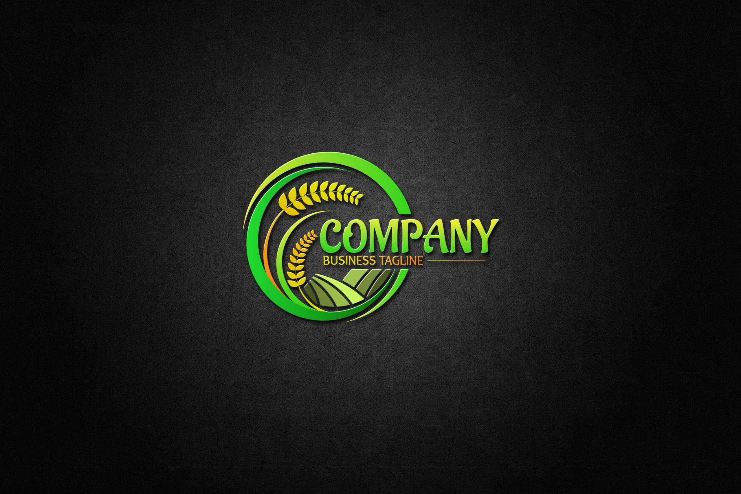
For farming and agricultural businesses, a circle can represent the cyclical nature of seasons and growth, a metaphor for renewal and sustainability. We've created circular logos for farms incorporating wheat stalks or leaf patterns to emphasize this connection to nature, feeling organic and honest.
Construction companies benefit from the solidity and strength a circle can project. A well-executed circular logo communicates stability and trustworthiness, essential qualities in an industry built on foundations. A circular logo can incorporate a stylized building or architectural element.
In fashion, circular logos represent a brand’s cyclical collections, the seasons of style, or a sense of elegance and sophistication. A circular logo can also serve as a canvas for creative patterns and textures, adding a unique visual element to a brand’s identity.
Circular Logos in Practice
- Burger King - The iconic Burger King logo, enclosed in a circle, uses bold typography and color to convey a sense of classic Americana and fast-food appeal, remaining instantly recognizable across diverse locations.
- Target - Target’s bullseye logo is a prime example of simplicity and memorability; the single red circle immediately identifies the brand and is versatile enough for use on packaging, in-store displays, and digital platforms.
- BP - BP’s circular logo, featuring a sunburst design, represents energy and forward movement, effectively communicating the company’s role in the oil and gas industry while aiming for a modern feel.
- Adidas - Though variations exist, Adidas frequently utilizes a circular logo element, often with three stripes, which symbolizes the company’s commitment to performance and athletic achievement and is easily adaptable to different product lines.
- Starbucks - The Starbucks siren logo, contained within a circle, evokes a sense of maritime tradition and adventure, while the green and white color scheme suggests freshness and quality, appealing to a broad customer base.
- NASA - NASA’s circular ‘meatball’ logo, with its stars and stripes, represents American space exploration and technological advancement, conveying authority and innovation in a clear, symbolic design.
- BMW - The BMW circular logo, originally representing a rotating propeller, now symbolizes the company’s history in aviation and its commitment to engineering excellence, remaining a globally recognized mark of luxury vehicles.
Beyond the Basic Circle: Variations
A circle doesn't have to be a perfect, unbroken shape to be effective. Some of the most interesting circular logos play with the form. A broken circle can suggest dynamism, incompleteness (and therefore, potential for growth), or openness. It's a subtle way to add visual interest.
Overlapping circles create depth and complexity, suggesting connection and collaboration, useful for companies emphasizing partnerships or community. The interplay of colors and shapes within overlapping areas can be visually striking.
Circles within circles add layers of meaning and visual hierarchy. The inner circle can highlight a key brand element, while the outer circle provides containment and protection. This technique is effective with negative space, allowing the background to peek through for a more dynamic design.
3D Circular Logos: Adding Depth
Demand for 3D circular logos is increasing. The added depth and dimension make a logo more memorable and modern, feeling tactile and engaging in a digital world. A subtle 3D effect can elevate a simple circular logo.
Designing 3D logos requires technical expertise, involving careful consideration of lighting, perspective, and rendering, not just adding a drop shadow. File formats are also important; vector formats like SVG are ideal for scalability, while raster formats like PNG may be needed for specific applications.
Creating 3D circular logos requires a skilled team, handling all aspects from concept to final file delivery. Proficiency in industry-standard software ensures your logo looks its best across all platforms. Understanding the nuances of rendering and file preparation guarantees a polished, professional result.
Circular Logos & Brand Versatility
A circular logo's versatility is a major advantage. It works on t-shirts, signage, website favicons, and social media profiles, maintaining brand consistency across all touchpoints.
undefined-designed circular logo will maintain its integrity and impact, whether it’s displayed on a small mobile screen or a large billboard. The simple shape avoids the distortion issues that can plague more complex designs. It’s an investment that will pay off in the long run.
Ultimately, a circular logo is more than just a pretty picture. It’s a fundamental component of a brand’s visual identity, conveying its values, personality, and promise to customers. It’s a subtle but powerful way to create a lasting impression.
Common Mistakes to Avoid
While circular logos are generally safe, there are a few pitfalls to watch out for. Overcrowding the circle with too many elements is a common mistake. Simplicity is key. A cluttered logo will appear messy and confusing. Less is almost always more.
Using too many colors can also detract from the overall impact. A limited color palette – two or three colors at most – is generally more effective. Consider the psychological associations of different colors and choose colors that align with your brand’s personality.
Finally, make sure the font you choose complements the circular shape. Avoid overly ornate or complex fonts that will clash with the logo’s overall aesthetic. A clean, modern sans-serif font is often a good choice. Pay attention to kerning and leading to ensure readability.
- Avoid overcrowding: Keep the design simple and focused.
- Limit your color palette: Two or three colors are usually sufficient.
- Choose a complementary font: Opt for clean, modern typefaces.
Foresight Creative: Your Circular Logo Partner
At Foresight Creative, we specialize in creating unique, memorable logos that capture the essence of your brand. We have a proven track record of success across a wide range of industries, and we’re passionate about helping our clients achieve their business goals. We are confident in our ability to deliver a circular logo that exceeds your expectations.
If you’re considering a circular logo for your brand, we’d love to hear from you. Contact us today for a free consultation and let’s discuss how we can help you create a visual identity that stands out from the crowd.
No comments yet. Be the first to share your thoughts!