
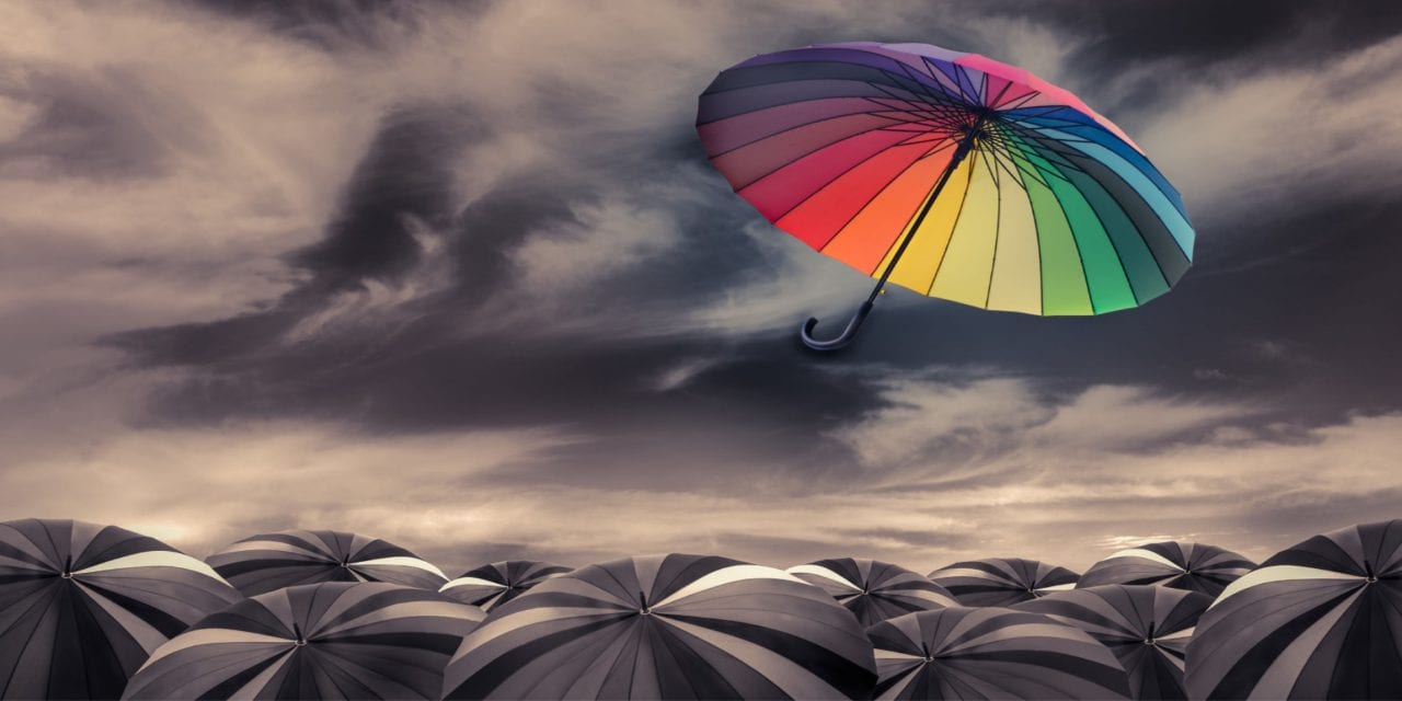
Why minimalism leads 2026 branding
Minimalism is no longer just a stylistic choice; it is the dominant language of 2026 branding. As digital interfaces become increasingly crowded, clarity has become the ultimate luxury. Brands are stripping away decorative excess to focus on what matters: recognition, scalability, and immediate comprehension. This shift reflects a broader industry move toward functional design that performs reliably across every screen size and context.
The driving force behind this trend is the demand for versatility. A minimalist logo must work as small as a mobile app icon and as large as a billboard without losing its integrity. Complex details that vanish at small scales are being replaced by bold, geometric forms and clean typography. This ensures that a brand’s identity remains consistent whether it appears on a business card, a website header, or a social media avatar.
Clarity also builds trust. In a market saturated with visual noise, simple designs cut through the clutter. They signal confidence and professionalism, suggesting that a brand is focused and purposeful. For businesses looking to establish a strong presence in 2026, embracing minimalism is not about doing less; it is about communicating more effectively.
Vintage aesthetics in modern construction logos
Vintage aesthetics in modern construction logos blend heritage with contemporary utility. These designs signal durability and trust, qualities essential in an industry built on longevity. By referencing historical craftsmanship, construction brands distinguish themselves in a crowded market.
Key Visual Elements
Vintage construction branding relies on specific visual cues to communicate stability and experience. These elements create an immediate association with reliability and established expertise.
Key Visual Elements
-
Bold Serif Typography
Thick, traditional typefaces convey strength and authority, mirroring the structural integrity of the buildings constructed. -
Muted Earth Tones
Palettes featuring slate gray, rust orange, and navy blue reflect materials like steel, brick, and concrete, grounding the brand in physical reality. -
Emblem or Crest Layouts
Circular or shield-shaped badges evoke official certification and established presence, suggesting a company that has stood the test of time.
Foresight Creative leverages these principles to help construction firms build a visual identity that resonates with clients seeking dependable partners. The goal is not to look old, but to look enduring.
Interior design logos that define space
Interior design firms use logos to signal spatial awareness before a client walks through the door. The mark must feel like an extension of the rooms they design—structured, textured, and lived-in. A strong logo here acts as a visual blueprint, communicating scale, materiality, and lifestyle aesthetics without relying on abstract art.
Modern interior design logos often borrow from architectural elements. Think of negative space used to suggest doorways or floor plans. Texture is equally important; grainy fonts or rough-edged vector lines mimic raw materials like concrete, wood, or stone. This tactile quality bridges the gap between digital screens and physical spaces.
Foresight Creative approaches these designs by treating the logo as a spatial object. We explore how a monogram might wrap around a corner or how a geometric shape can imply depth. The goal is to create a brand identity that feels grounded in the real world, reflecting the firm’s ability to shape functional and experiential systems.
When executed well, these logos don’t just sit on a business card; they inhabit the space. They promise a design philosophy that values precision and atmosphere, setting the tone for the client’s future environment.
Fashion brands embrace retro typography
Fashion houses are turning to vintage typography to build brand identities that feel both timeless and contemporary. This trend moves away from the ultra-minimalist sans-serif fonts of the 2010s, favoring serif typefaces with historical roots and subtle quirks. By adopting these classic letterforms, brands signal heritage and craftsmanship, even if the company itself is new.
The approach relies on a minimalist layout to let the typography breathe. Clean lines and ample white space frame the retro fonts, creating a sophisticated contrast that feels modern without being sterile. This balance allows the logo to remain legible across digital avatars and physical clothing tags, ensuring consistency in a visual-first market.
Foresight Creative helps fashion labels navigate this aesthetic by selecting typefaces that align with their specific narrative. Whether it’s a nod to 1970s editorial design or early 20th-century luxury branding, the goal is to create a mark that stands out in a crowded feed while maintaining an air of established authority.
This strategy works because it taps into a collective nostalgia for quality and permanence. In an industry driven by fleeting trends, a retro-inspired logo offers a sense of stability. It tells the consumer that the brand is built to last, not just to trend.
How Foresight Creative Applies These Trends
Foresight Creative treats logo design as a functional system rather than a static image. As a multidisciplinary design and advisory firm, we shape the experiential systems behind high-performing assets. This approach ensures that every visual element serves a strategic purpose, from brand recognition to user engagement.
Our process integrates current 2026 design trends with long-term brand viability. We do not simply apply aesthetic filters; we engineer logos that adapt across digital and physical touchpoints. By combining functional strategy with experiential design, we create visual identities that remain relevant as technology and consumer behavior evolve.
We apply these principles across diverse industries, ensuring each logo resonates with its specific audience while maintaining structural integrity. Whether refining an existing mark or building a new identity, our focus remains on clarity, adaptability, and enduring value. This method transforms logos from decorative elements into core business assets.
Frequently asked questions about 2026 logo trends
Do minimalist logos last longer than vintage styles?
Minimalist logos tend to age better because they rely on strong geometric foundations rather than temporary decorative trends. A clean, simplified mark remains legible across small mobile screens and large billboards alike. Vintage styles often depend on specific textures or typography that can feel dated within a few years. We recommend starting with a minimalist structure and adding vintage-inspired details only if they serve a clear brand story.
Can I mix minimalist and vintage elements in one logo?
Yes, blending these approaches creates a balanced identity that feels both modern and established. Use a minimalist icon or wordmark as the primary anchor, then apply vintage color palettes or subtle texture overlays for secondary applications. This hybrid approach keeps the logo functional for digital use while retaining the warmth of traditional design. It allows your brand to feel current without losing its heritage.
How often should I update my logo to stay on trend?
You should not update your logo just to follow annual trends. A well-designed logo should remain stable for five to ten years, with only minor refinements to adapt to new media formats. Major rebrands are expensive and can confuse loyal customers. Focus on evolving your visual system—such as packaging or web design—to reflect 2026 trends while keeping your core logo intact.
Is a minimalist logo too plain for my brand?
Minimalism is about clarity, not emptiness. A well-executed minimalist logo uses negative space and precise proportions to convey sophistication. It stands out in a crowded market by being easy to remember and reproduce. If your brand values innovation and efficiency, a minimalist approach often communicates those traits more effectively than complex, ornate designs.
No comments yet. Be the first to share your thoughts!