
Why Foresight Creative Leads in Logo Design
A logo is not just a graphic; it is the visual anchor for your brand’s identity. At Foresight Creative, we treat logo design as a bridge between abstract concepts and operational reality. We don't rely on fleeting aesthetics. Instead, we build marks that endure, ensuring your brand communicates clearly whether it appears on a business card or a digital billboard.
Our approach combines two distinct but complementary styles: minimalist clarity and vintage character. Minimalist logos strip away noise to focus on essential meaning, while vintage-inspired designs add depth and heritage through textured typography and classic layouts. This duality allows us to tailor every mark to the specific industry and audience, from tech startups to established heritage brands.
We prioritize visual-first storytelling. Every line, curve, and color choice is deliberate. By focusing on concrete examples rather than abstract trends, we create logos that are immediately recognizable and professionally executed. This method ensures that your brand doesn't just stand out—it stands the test of time.

The Rise of Minimalist Logo Designs
Branding in 2026 is shedding the noise. We are seeing a decisive shift toward clean, scalable, and functional minimalism. This isn't just an aesthetic choice; it is a response to how brands are consumed today. A logo must perform flawlessly on a smartwatch screen and a skyscraper billboard. Simplicity ensures that message stays intact across every medium.
Foresight Creative specializes in this precise balance. We strip away decorative elements that distract from the core identity. The result is a mark that is instantly recognizable and difficult to misinterpret. In a crowded digital landscape, clarity is the ultimate currency.

Modern minimalist logos rely on a few core characteristics to achieve their impact:
Key Characteristics of Modern Minimalist Logos
-
Scalability
Designs that maintain clarity and legibility at any size, from favicon to large format print. -
Negative Space Usage
Strategic use of empty space to create secondary meanings or improve visual balance without adding clutter. -
Limited Color Palettes
Restricting colors to two or three ensures consistency and reduces production costs across various materials. -
Geometric Precision
Clean lines and simple shapes that convey stability and modern professionalism.
This approach prioritizes function over decoration. By focusing on essential forms, we create logos that endure beyond fleeting trends. The goal is not just to look good, but to work effectively in every context.
Vintage Logo Designs Making a Comeback
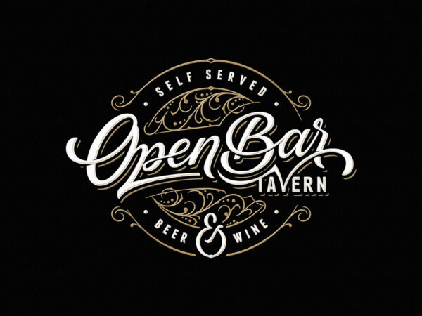
The pendulum of design has swung back toward the past. Nostalgia is no longer a quirky trend; it is a primary driver of brand identity in 2026. Consumers crave the authenticity and heritage that vintage aesthetics provide, seeking a tactile connection in an increasingly digital world. This movement is not about copying history, but about reinterpreting it with modern precision.
At Foresight Creative, we see this resurgence as a strategic opportunity. Vintage logos leverage texture, serif typography, and heritage cues to build immediate trust. They signal that a brand has depth, experience, and a commitment to quality that transcends fleeting fads. When executed well, these designs feel both timeless and contemporary.
The key to a successful vintage logo lies in the details. Rough edges, muted color palettes, and classic serif fonts evoke a sense of craftsmanship. These elements work together to create a visual language that feels established and reliable. It is the visual equivalent of a well-worn leather journal—inviting, substantial, and full of story.

Foresight Creative specializes in blending these classic elements with modern minimalism. We strip away the clutter while retaining the soul of the vintage style. The result is a logo that feels grounded and authentic, capable of standing out in a crowded market without shouting. This approach ensures that your brand identity resonates with consumers who value substance over style.
Industry-specific logo applications
Foresight Creative adapts minimalist and vintage aesthetics to match the distinct visual language of each sector. We don't apply a single template across the board. Instead, we tailor the weight of lines, the choice of typography, and the level of detail to fit the industry's core values.
In construction, bold geometry signals stability. We use heavy sans-serif fonts and simple, structural shapes to convey reliability. For farming, organic curves and earth tones connect the brand to the land, suggesting growth and natural quality. Fashion brands often lean into vintage elegance, using serif typography and intricate linework to communicate heritage and luxury.
These distinct approaches ensure the logo resonates with the target audience immediately. A construction firm needs to look solid, not delicate. A fashion label needs to look timeless, not utilitarian. Foresight Creative balances these needs to create logos that are both relevant and enduring.
No comments yet. Be the first to share your thoughts!