
Logos and client trust
A logo is the fastest way a client judges your business. Neurological marketing research shows people form opinions in under 90 seconds, and most of that happens subconsciously. A messy logo kills trust before you even open your mouth.
For interior designers, this is particularly critical. You aren’t selling a product; you’re selling a feeling, a transformation of a deeply personal space. Clients are inviting you into their homes, their sanctuaries. The logo is often the first tangible representation of your taste, your understanding of aesthetics, and your ability to deliver on a promise. It’s a silent handshake.
Trust is built on predictability and reliability. A logo that feels haphazard, inconsistent, or simply off can signal a lack of attention to detail, which directly translates to concerns about the quality of your design work. We've seen, at Foresight Creative, how a well-executed logo can immediately put clients at ease, opening the door for a more collaborative and successful project. It’s not just about looking good; it’s about conveying competence and care.
Consider the psychology of risk. People inherently avoid uncertainty. A strong logo minimizes that uncertainty, telling the client, 'You can trust me to handle something as important as your home.' A weak logo, conversely, amplifies it. It’s a subtle but powerful dynamic.
Color choices for interior brands
Color psychology is a well-studied field, but its application to interior design logos requires nuance. While broad associations – blue for tranquility, red for energy – exist, the shade and combination of colors are far more important. A dusty rose can feel vintage and comforting, while a bright magenta can feel modern and daring. It’s about the specific feeling you want to evoke.
Right now, designers are leaning into sage greens, terracotta, and warm beiges. These earthy tones feel sophisticated and grounded. Deep teals and navy are still around because they feel stable, though they're starting to feel a bit overused compared to the newer, warmer palettes.
Looking ahead to 2026, forecasting suggests a resurgence of warmer, bolder palettes, but used strategically. Expect to see ochre, rust, and even burnt orange incorporated as accent colors to convey creativity and confidence. However, these bolder colors need to be balanced with neutrals to avoid overwhelming the viewer.
Cultural context is also crucial. What’s perceived as luxurious in one culture might be associated with mourning in another. For instance, white often symbolizes purity and cleanliness in Western cultures, but in some East Asian cultures, it’s traditionally associated with death. A designer working with a diverse clientele needs to be aware of these variations.
Interior Design Logo Psychology: Color Palette & Shape Decision Matrix (Projected 2026 Trends)
| Color Palette | Perceived Cost/Luxury | Emotional Impact | Brand Personality Associations | Suitable Interior Design Styles |
|---|---|---|---|---|
| Muted Earth Tones (Beige, Terracotta, Olive) | Moderate to High - Suggests quality and natural materials. | Calming, grounding, trustworthy, organic. | Sophisticated, reliable, down-to-earth, sustainable. | Farmhouse, Scandinavian, Bohemian, Rustic |
| Bold Jewel Tones (Emerald, Sapphire, Ruby) | High - Conveys opulence and exclusivity. | Dramatic, luxurious, energetic, confident. | Elegant, bold, creative, high-end. | Hollywood Regency, Art Deco, Maximalist, Luxury Contemporary |
| Monochromatic Gray Scale | Variable - Can be perceived as budget-friendly or highly sophisticated depending on execution. | Neutral, professional, balanced, understated. | Modern, minimalist, sleek, timeless. | Modern, Minimalist, Industrial, Contemporary |
| Warm Neutrals with Accents of Ochre/Rust | Moderate - Balances approachability with a sense of curated style. | Welcoming, comforting, creative, sophisticated. | Authentic, artistic, inviting, refined. | Mid-Century Modern, Transitional, Eclectic |
| Soft Pastels (Dusty Rose, Sage Green, Powder Blue) | Moderate - Suggests a gentle, approachable luxury. | Peaceful, serene, delicate, optimistic. | Feminine, gentle, creative, calming. | Cottagecore, French Country, Shabby Chic, Coastal |
| Deep Teal & Gold Combinations | High - Evokes a sense of richness and sophistication. | Calming yet luxurious, creative, trustworthy. | Elegant, refined, artistic, balanced. | Traditional, Glam, Transitional, Eclectic |
| Black & White with Geometric Shapes | Variable - Can be perceived as minimalist and affordable or high-contrast and exclusive. | Striking, modern, balanced, sophisticated. | Bold, contemporary, innovative, authoritative. | Modern, Art Deco, Scandinavian, Minimalist |
Illustrative comparison based on the article research brief. Verify current pricing, limits, and product details in the official docs before relying on it.
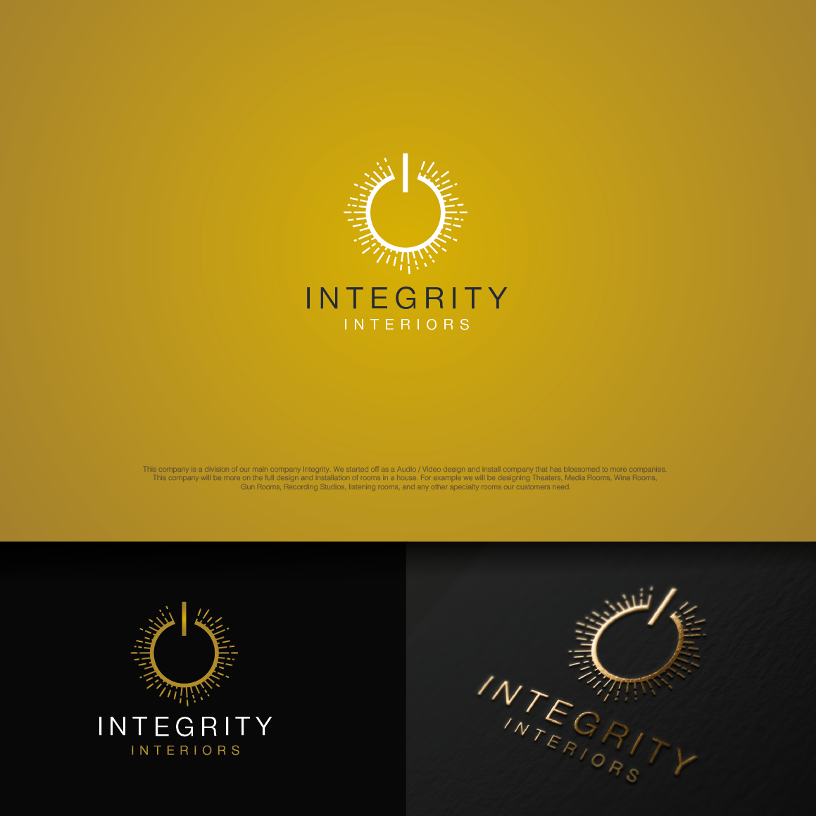
How shapes change perception
Shapes communicate on a subconscious level, often independently of color. Circles generally evoke feelings of wholeness, harmony, and community. They're approachable and inviting, making them a good choice for designers wanting to project a welcoming and collaborative image. Squares and rectangles, on the other hand, convey stability, structure, and trustworthiness – qualities appealing to clients seeking a reliable and organized designer.
Triangles can be more complex. Upward-pointing triangles suggest aspiration and growth, while downward-pointing triangles can feel unsettling or unstable. Organic, flowing shapes communicate creativity, naturalism, and a more relaxed aesthetic. These are often a good fit for designers specializing in bohemian or eclectic styles.
It’s important to remember that these are tendencies, not hard rules. The context of the shape within the overall logo design is key. A sharp, angular logo doesn’t automatically scream "modern’ – it could also feel cold or impersonal if not balanced with softer elements. We find at Foresight Creative that successful logos use shape to subtly reinforce the brand"s personality.
Consider how a logo’s form relates to the spatial concepts inherent in interior design. A logo with a strong sense of depth or dimension might appeal to clients interested in creating layered and visually rich interiors, while a flat, minimalist logo could resonate with those preferring clean lines and open spaces.
Using typography to show authority
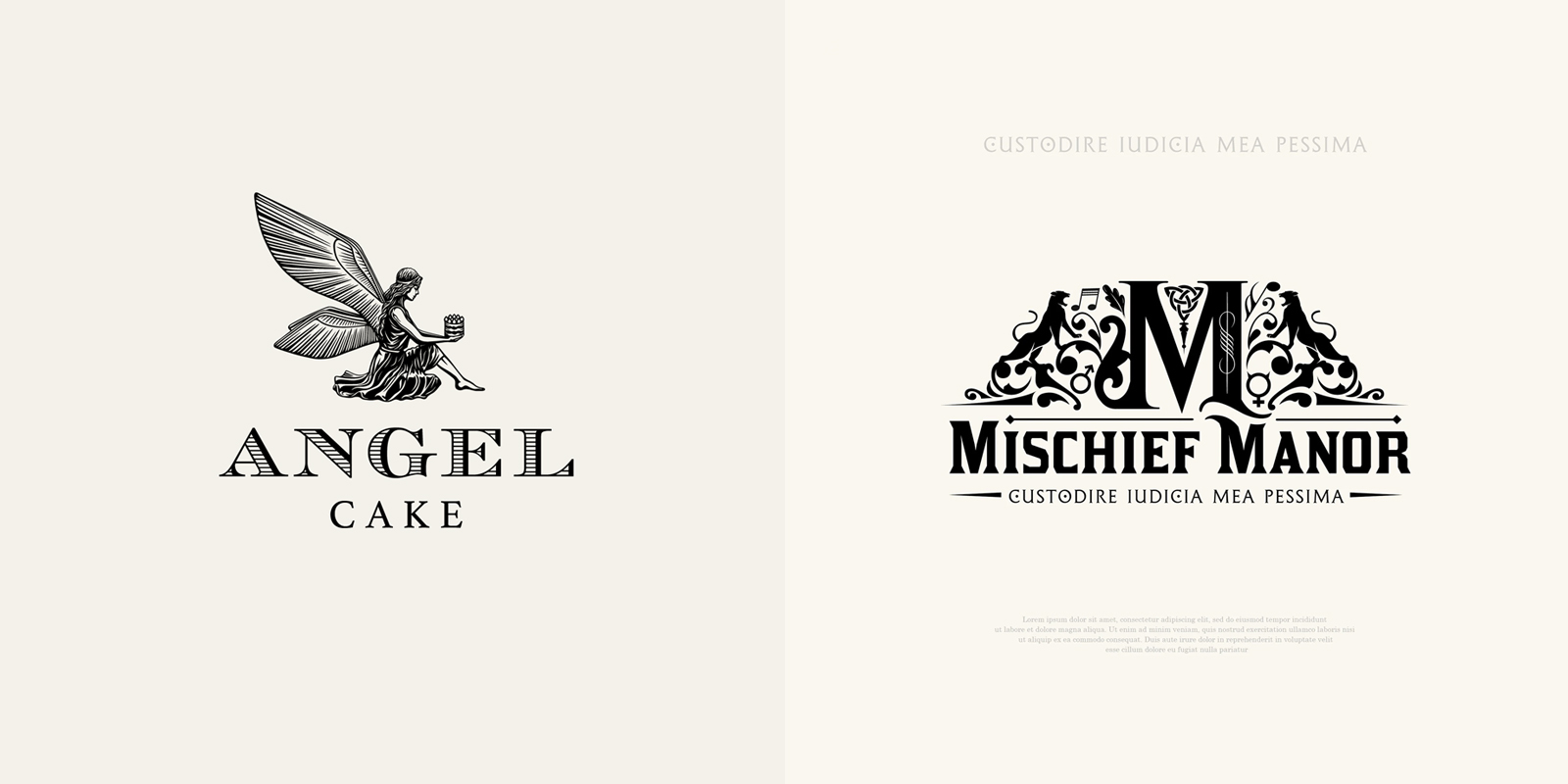
Font choice is surprisingly powerful. A well-chosen typeface can elevate a logo, while a poor choice can undermine it. Serif fonts, with their traditional strokes, often convey a sense of history, authority, and sophistication. They’re a good fit for designers specializing in classic or traditional styles.
Sans-serif fonts, with their clean lines, project modernity, simplicity, and efficiency. They’re popular among designers embracing a minimalist aesthetic. However, a generic sans-serif font can also come across as bland or impersonal. The key is to choose a font that feels unique and reflects the brand’s personality.
The weight and style of the font also matter. Bold fonts convey strength and confidence, while light fonts can feel delicate and elegant. Italicized fonts can add a touch of sophistication or emphasis, but overuse can make a logo look cluttered. Pay attention to kerning (the space between letters) and leading (the space between lines) – these details can significantly impact readability and overall visual appeal.
The rise of variable fonts offers exciting possibilities. These fonts allow for a wider range of weights and styles within a single file, enabling designers to create more dynamic and adaptable logos. This is a trend we are seeing more of at Foresight Creative as it allows for greater flexibility across different platforms.
- Playfair Display paired with Montserrat works well for a balance of tradition and modern clean lines.
- Unsuccessful Font Pairings: Comic Sans MS + Times New Roman
Effective Font Pairings
- Playfair Display & Montserrat - The contrast between Playfair Display’s classic, high-contrast serif and Montserrat’s clean, geometric sans-serif evokes a sense of sophisticated tradition blended with modern functionality. This pairing suggests a designer who respects history but delivers contemporary results. Example: Used by several boutique hotel branding projects.
- Lora & Open Sans - Lora, a well-balanced serif with roots in calligraphy, paired with the highly readable Open Sans, creates a warm and approachable feel. This combination is ideal for interior designers focusing on residential projects and emphasizes comfort and livability. Example: Frequently seen in branding for home staging companies.
- Poppins & Raleway - Both Poppins and Raleway are geometric sans-serifs, but Poppins is slightly more rounded and friendly, while Raleway is more streamlined and elegant. Together, they offer a modern, minimalist aesthetic that conveys precision and taste. Example: Popular among firms specializing in Scandinavian design.
- Cormorant Garamond & Lato - Cormorant Garamond, a classic serif with a luxurious feel, combined with Lato’s clean and modern sans-serif form, projects a sense of refined elegance and accessibility. This pairing suits designers working with high-end clients. Example: Used in branding for luxury furniture retailers.
- Merriweather & Roboto - Merriweather, a serif designed for on-screen readability, and Roboto, a modern humanist sans-serif, create a balanced and approachable look. This pairing is versatile and works well for a broad range of interior design styles. Example: Often used by interior design bloggers and online publications.
- Didot & Montserrat - Didot’s high contrast and elegant lines, paired with Montserrat’s geometric clarity, create a sophisticated and stylish impression. This pairing is well-suited for designers focusing on luxury or fashion-forward interiors. Example: Seen in branding for high-end textile companies.
- Archivo Black & Rubik - Archivo Black, a bold and impactful slab serif, paired with Rubik’s rounded, friendly sans-serif, creates a strong yet approachable feel. This combination is effective for designers who want to convey confidence and creativity. Example: Used by firms specializing in commercial spaces.
Minimalism vs. vintage styles in 2026
Both minimalist and vintage logo styles can effectively build client trust, but they appeal to different audiences. Minimalism, characterized by simplicity, clean lines, and ample white space, conveys sophistication, efficiency, and a sense of curated taste. It’s a strong choice for designers targeting a modern, discerning clientele.
Vintage logos, drawing inspiration from historical design trends, evoke a sense of craftsmanship, heritage, and authenticity. They can be particularly effective for designers specializing in restoration or period-specific interiors. However, a poorly executed vintage logo can look dated or cluttered.
In 2026, I believe we'll see a continued demand for both styles, but with a greater emphasis on intentionality. Clients will be less interested in simply following a trend and more focused on logos that genuinely reflect their brand values. A minimalist logo needs to feel thoughtfully considered, not just stripped down. A vintage logo needs to feel authentic, not kitschy.
At Foresight Creative, we’ve found that the most successful approach is to tailor the logo style to the client’s specific brand identity and target audience. There’s no one-size-fits-all solution. It's about understanding their vision and translating it into a visual representation that resonates with their ideal client.
Logos in Context: Beyond the Icon
A logo isn’t an isolated entity. It needs to function seamlessly across all brand touchpoints – website, social media, business cards, signage, and even email signatures. Consistency is paramount. Using different variations of the logo haphazardly can dilute brand recognition and erode trust.
Develop a logo guide that outlines the approved color palettes, fonts, and logo variations. This ensures that everyone involved in representing the brand – the designer, the client, and any marketing partners – is on the same page. Include guidelines for logo usage, such as minimum size requirements and clear space.
Consider creating logo variations for different contexts. A horizontal version might be ideal for website headers, while a vertical version might be better suited for social media profiles. A simplified version can be used for small applications, such as favicons or app icons.
Remember that a logo is a dynamic element. It may need to be updated or refined over time to reflect changes in the brand’s identity or the evolving design landscape. But any changes should be made thoughtfully and strategically, always with an eye towards maintaining brand consistency.
No comments yet. Be the first to share your thoughts!