
Minimalism is more than a trend
We're seeing a clear shift in logo design, and it's not simply a fleeting aesthetic choice. Minimalism isn’t just popular right now; it feels like a necessary response to the overwhelming visual noise of modern life. People are actively seeking clarity and simplicity in everything they consume, and that extends to how brands present themselves. It’s a reaction against the overly complex, gradient-heavy designs that dominated the early 2010s.
This isn’t just about aesthetics, though. The rise of minimalism is connected to broader cultural trends—a desire for authenticity, a focus on essential values, and a rejection of excess. Digital platforms play a huge role, too. Logos need to be instantly recognizable across countless devices and screen sizes, and a simpler design scales much more effectively than something intricate. A logo that looks good as an app icon is a logo that’s built to last.
I believe this move towards simplicity is ultimately about building trust. In a world saturated with marketing messages, a clean, uncluttered logo communicates confidence and transparency. It says, "We’re not trying to overwhelm you; we’re offering something clear and valuable." This is why we're seeing more brands, even in traditionally 'loud' industries, embrace a minimalist approach.
How AI changes logo design
The emergence of AI logo generators has undeniably shaken up the design world. These tools promise quick, affordable logos, and they've certainly lowered the barrier to entry for new businesses. However, the sheer volume of AI-generated logos is also creating a problem: a sea of sameness. Most of these tools rely on existing design patterns and readily available imagery.
The fundamental limitation of AI is its inability to grasp the nuances of a brand’s identity. It can analyze data and identify trends, but it can’t understand the why behind a brand’s values, its target audience, or its unique story. This results in logos that are technically proficient but utterly lacking in originality and emotional resonance. They’re often generic and forgettable.
It’s not about fearing AI taking over design completely. It's about recognizing its current limitations. AI is a tool, and like any tool, it’s only as good as the person using it. Relying solely on AI to create a logo is a shortcut that often sacrifices quality and distinctiveness. A truly effective logo needs a human touch—strategic thinking, creative exploration, and a deep understanding of the brand.
Opened my morning with some few Minimalist logo designs.🌅
— 0ffocus (@N1WJourney) June 28, 2025
What is your favorite?#design #branding #buildinpublic #web3 pic.twitter.com/1x3gbKqSZO
The AI-resistant philosophy
At Foresight Creative, we’ve been talking a lot about "AI-resistant’ design. This isn’t about creating logos that AI can’t replicate—that"s a losing battle. It's about crafting designs that AI won’t produce in the first place, because they require a level of conceptual thinking and intentionality that AI currently lacks. It’s about going beyond trends and algorithms.
These designs are characterized by a deliberate departure from predictable patterns. We focus on subtle asymmetry, unexpected color combinations, and the use of negative space to create hidden meanings. We prioritize conceptual thinking—exploring the underlying ideas and emotions that a brand represents—and translating those into visual form. It requires a lot more work upfront, but the results are far more impactful.
A key element is embracing imperfection. AI tends to strive for flawless symmetry and perfect proportions. We, on the other hand, often introduce subtle irregularities that add character and humanity to a design. It’s these imperfections that make a logo feel authentic and memorable. It’s a deliberate choice to move away from the algorithmic perfection that AI favors. We believe this is the path to long-term brand strength.
Six minimalist trends for 2026
By 2026, I expect these six styles to lead. They aren't just pretty; they solve the problem of brand clutter. Our clients are already asking for them.
First, geometric abstraction with subtle gradients. Think clean shapes—circles, squares, triangles—combined with extremely subtle gradients to add depth and visual interest. It's not the bold gradients of the past; these are muted and sophisticated. Second, monoline designs with custom typography. A single, unbroken line used to create both the logo mark and the brand name, often with a bespoke typeface designed specifically for the brand. This creates a sense of fluidity and elegance.
Third, negative space logos with hidden meanings. Cleverly utilizing the space around the logo mark to create a secondary image or symbol. This adds a layer of intrigue and encourages viewers to engage with the design on a deeper level. Fourth, earthy color palettes inspired by natural textures. Moving away from bright, artificial colors and embracing muted tones—ochre, terracotta, sage green—that evoke a sense of warmth and authenticity. These palettes often reflect a brand’s commitment to sustainability or natural products.
Fifth, simplified wordmarks with unique letterforms. Logos that focus solely on the brand name, but with a distinctive typographic treatment. This could involve custom letterforms, unusual kerning, or subtle variations in weight and style. Finally, micro-animations for digital applications. Subtle animations—a slight pulse, a gentle shift in color—that add a touch of dynamism to a logo when viewed on a screen. This is becoming increasingly important as more and more brands interact with customers online.
These trends aren’t isolated; they often overlap and complement each other. The key is to use them thoughtfully and strategically, ensuring they align with the brand’s overall identity and values. A successful logo isn’t just visually appealing; it’s a powerful communication tool.
Emerging Logo Trends
- Geometric Simplicity - Logos are increasingly utilizing basic geometric shapes – circles, squares, triangles – to convey stability and modernity. These forms are difficult for AI to replicate with nuance.
- Negative Space Integration - Clever use of negative space continues to gain traction, creating memorable and sophisticated marks. This technique relies on human perception and is less easily duplicated by algorithmic design.
- Hand-Drawn Aesthetics - A return to organic, hand-drawn elements offers a distinctly human touch. Imperfections and unique linework are key differentiators against AI-generated uniformity.
- Monoline Weight Variations - Logos featuring a single line weight, but with subtle variations in thickness and curvature, are becoming popular. These variations require a skilled hand to execute effectively.
- Vintage-Inspired Typography - Classic serif and sans-serif fonts, often with subtle modifications, are being revitalized. The historical context and nuanced details of these typefaces are hard for AI to authentically reproduce.
- Abstract Mark Combinations - Combining two or more abstract shapes in a unique and unexpected way. This relies on conceptual thinking and visual balance, areas where AI currently struggles.
- Limited Color Palettes - Logos are trending towards extremely limited color palettes – often monochromatic or duotone. This focus on simplicity and impact makes the design more memorable and less susceptible to generic AI outputs.
Where minimalism works best
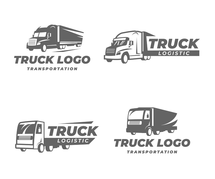
Minimalist logo design isn’t limited to any one industry. It’s a versatile approach that can be successfully applied across a wide range of sectors. At Foresight Creative, we’ve seen particularly strong results in interior design, trucking, farming, construction, and fashion.
In interior design, a minimalist logo conveys sophistication, elegance, and a focus on quality. Clean lines and neutral colors reflect the aesthetic of modern interior spaces. For trucking companies, minimalism can project trustworthiness and reliability – essential qualities in a logistical operation. A simple, bold logo suggests efficiency and professionalism. As highlighted in our article "From Farm to Brand’, we"ve seen a rise in farming businesses using 3D logos, but these are often paired with minimalist typography and color palettes to create a balanced and modern look.
For construction firms, a minimalist logo communicates stability, strength, and a commitment to precision. A clean, geometric design inspires confidence in the company’s ability to deliver high-quality work. In the fashion industry, minimalism is often associated with luxury, exclusivity, and timeless style. A simple, elegant logo can elevate a brand’s image and appeal to a discerning clientele. The key is to adapt the minimalist aesthetic to the specific nuances of each industry.
We recently designed a logo for a sustainable trucking company that used a simple, geometric representation of a road combined with an earthy color palette. The logo conveyed both the company’s commitment to environmental responsibility and its dedication to efficient transportation. Similarly, we created a logo for a high-end fashion brand that featured a custom monoline typeface and a subtle, almost imperceptible animation. The result was a logo that felt both modern and luxurious.
Building for the long term
Creating a logo that will remain relevant for years to come requires a focus on timeless design principles. Avoid fleeting trends and instead prioritize simplicity, clarity, and versatility. A logo that’s overly trendy may look dated in a few years. A logo that’s built on solid design foundations will stand the test of time.
Consider scalability and adaptability. Your logo should look good in a variety of formats—from a small app icon to a large billboard. It should be legible and recognizable in both color and black and white. Building a strong brand foundation—a clear understanding of your values, your target audience, and your unique selling proposition—is essential for long-term success. A logo is a symbol of that foundation, not a replacement for it. Trends from digitalsynopsis.com suggest a continued move towards simplicity, indicating this is a solid strategy for longevity.


No comments yet. Be the first to share your thoughts!