
First Impressions Matter: Logo Impact in Trucking
A strong logo is essential in the trucking industry. It acts as a visual shorthand for trust and reliability, crucial qualities when entrusting a company with valuable cargo and safety. A truck traveling thousands of miles is a constant, moving advertisement, seen by potential clients, other drivers, and the public, building brand recognition across vast distances.
Beyond visual identification, a well-designed logo communicates professionalism and attention to detail. For trucking companies handling complex logistics and high-value goods, this is particularly important. Clients need to feel confident, and a strong logo contributes to that feeling.
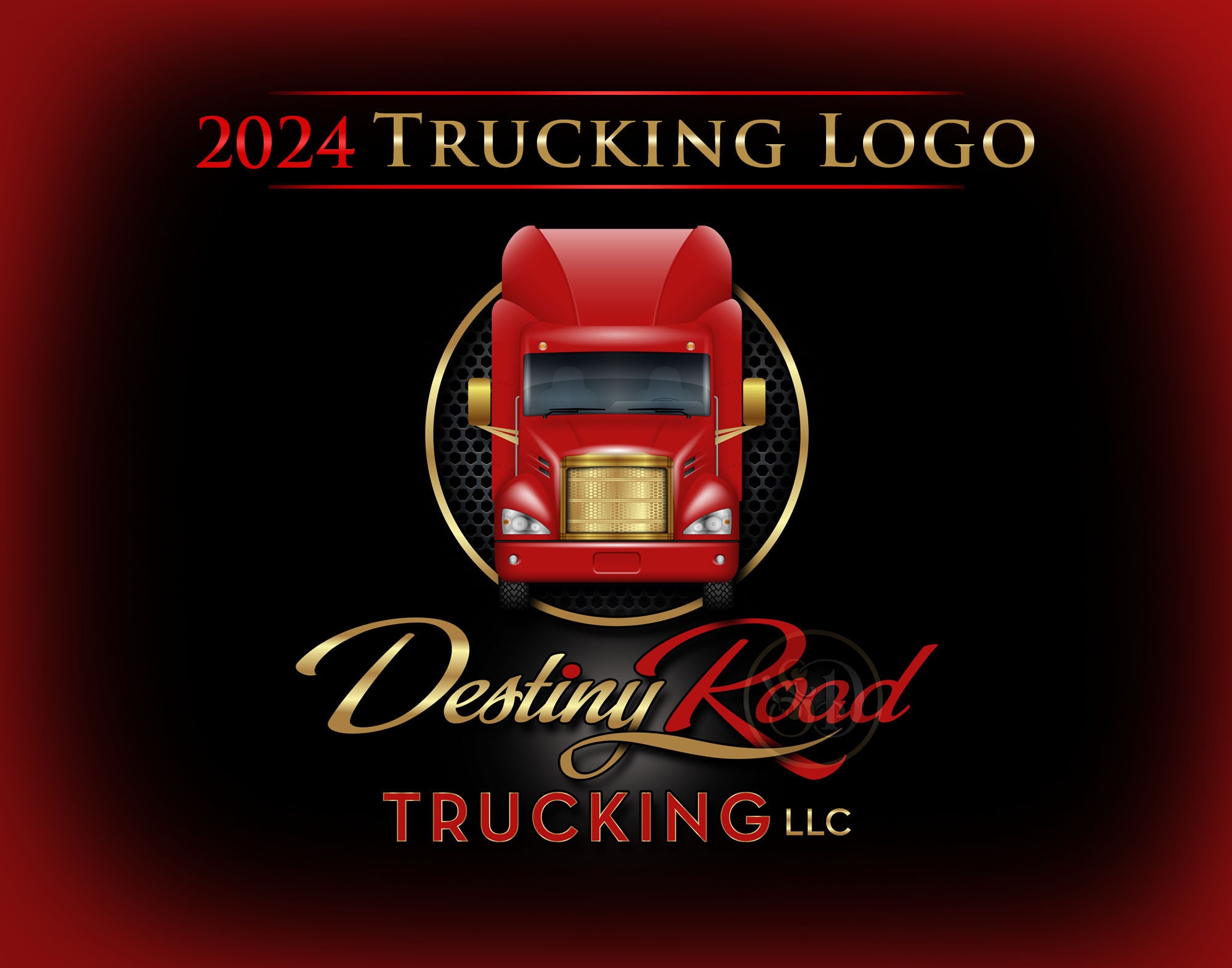
Historically, trucking logos often featured literal representations, like images of trucks. As design evolved, logos incorporated more dynamic imagery, such as eagles for freedom and power, or winding roads for the journey. Today, the trend is toward cleaner, modern designs, but the core principle remains: the logo is a mobile billboard that needs to make a lasting impression.
Decoding the Industry: Common Trucking Logo Themes
Common trucking logo imagery includes eagles for strength, freedom, and American spirit. Mountain silhouettes evoke resilience and overcoming challenges, important for navigating difficult terrain. Roads symbolize the journey and connection between destinations.
Flags represent national pride or regional dedication. Truck silhouettes remain popular, though increasingly stylized. These images tap into associations with power, reliability, and the open road.
However, clichés are easy to fall into. Overuse dilutes the impact of these themes. A long-haul company might use imagery suggesting distance and reliability, while a local delivery service might focus on speed and community connection. Find a unique angle and avoid copying others.
- Eagles: Strength, freedom, American spirit
- Mountains: Resilience, overcoming obstacles
- Roads: Journey, connection
- Flags: National pride, regional dedication
- Truck Silhouettes: Industry recognition
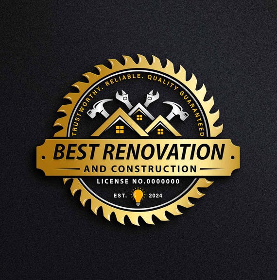
Common Trucking Logo Elements
- Truck Silhouettes - Instantly recognizable and directly communicates the core business. Variations include semi-trucks, flatbeds, or box trucks, depending on specialization.
- Roads & Highways - Symbolize movement, journey, and connection. Often depicted as winding paths or abstract lines representing routes.
- Eagles - Represent freedom, strength, and vision. A popular choice suggesting reliability and a broad reach.
- American Flag Elements - Conveys patriotism and a commitment to domestic transport, particularly relevant for US-based companies. Subtle integrations are often more effective than overt displays.
- Mountains - Suggest resilience, overcoming challenges, and the ability to handle difficult terrains. Useful for companies specializing in mountainous regions.
- Shields - Communicate security, protection, and trustworthiness. Implies a commitment to safe and reliable delivery.
- Global/Map Elements - Indicate a wide service area or international shipping capabilities. Can be abstract or detailed map outlines.
Modern Trends: Minimalism and Beyond
Minimalism is a dominant force in contemporary design, impacting the trucking industry. Logos are becoming more refined and focused, shifting from detailed illustrations to cleaner lines, simpler shapes, and strategic use of negative space.
Wordmarks, logos consisting solely of the company name, are gaining popularity. This approach relies heavily on typography; choosing the right font is crucial. Sans-serif fonts convey modernity and efficiency, while serif fonts evoke tradition and trustworthiness. Font weight, spacing, and style contribute to the logo’s message.
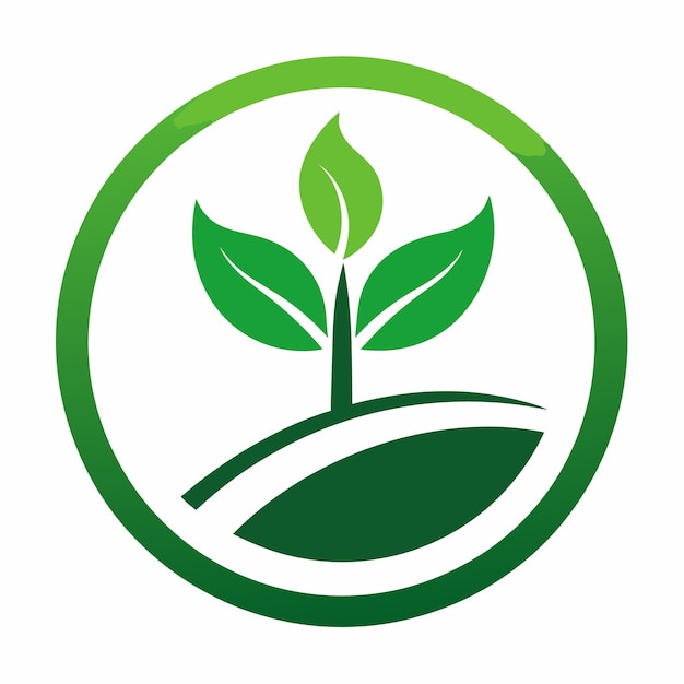
Color choices are evolving. Blues and reds have traditionally been popular in trucking – blue for trust, red for attention – but companies are experimenting with diverse palettes. Greens suggest sustainability, grays sophistication, and oranges energy. Muted, earthy tones are trending, perhaps reflecting a desire to appear grounded and approachable.
Vintage Routes: A Nod to Trucking History
For companies with decades of experience, a vintage-inspired logo communicates heritage. These logos often incorporate mid-20th century design elements, like ornate fonts, hand-drawn illustrations, and badges resembling classic road signs.
Distressed textures give a weathered, authentic look. Script fonts and bold, blocky serifs were common in older trucking logos. Balance vintage charm with modern readability; a logo that looks too dated can seem unprofessional.
The goal is to evoke history and experience while remaining relevant, not to replicate a 1950s logo exactly. Subtly incorporate vintage elements into a modern design framework. Done well, this creates a memorable and impactful brand identity.
- 1920s-1940s: Simple, text-based logos with bold fonts
- 1950s-1960s: Introduction of illustrative elements, badges, and more ornate fonts
- 1970s-1980s: Increased use of color and geometric shapes
- 1990s-2000s: A shift towards simpler, more streamlined designs
Beyond the Cab: Branding Consistency
A fantastic logo is a starting point; true branding success requires consistency across all touchpoints. Use the logo consistently on your website, social media, uniforms, marketing materials, and trucks.
Consider how the logo adapts to different applications: embroidery on uniforms, vinyl decals for trucks, or a small website favicon. Each may require slight variations for optimal visibility and clarity. A well-designed logo is versatile.
Create a comprehensive brand style guide. This document should outline logo colors (with hex codes), fonts, and usage guidelines. Specify how the logo should not be used—e.g., stretched, distorted, or altered. A style guide ensures consistent brand image representation.
Logos for Specific Niches: Farming, Construction, & More
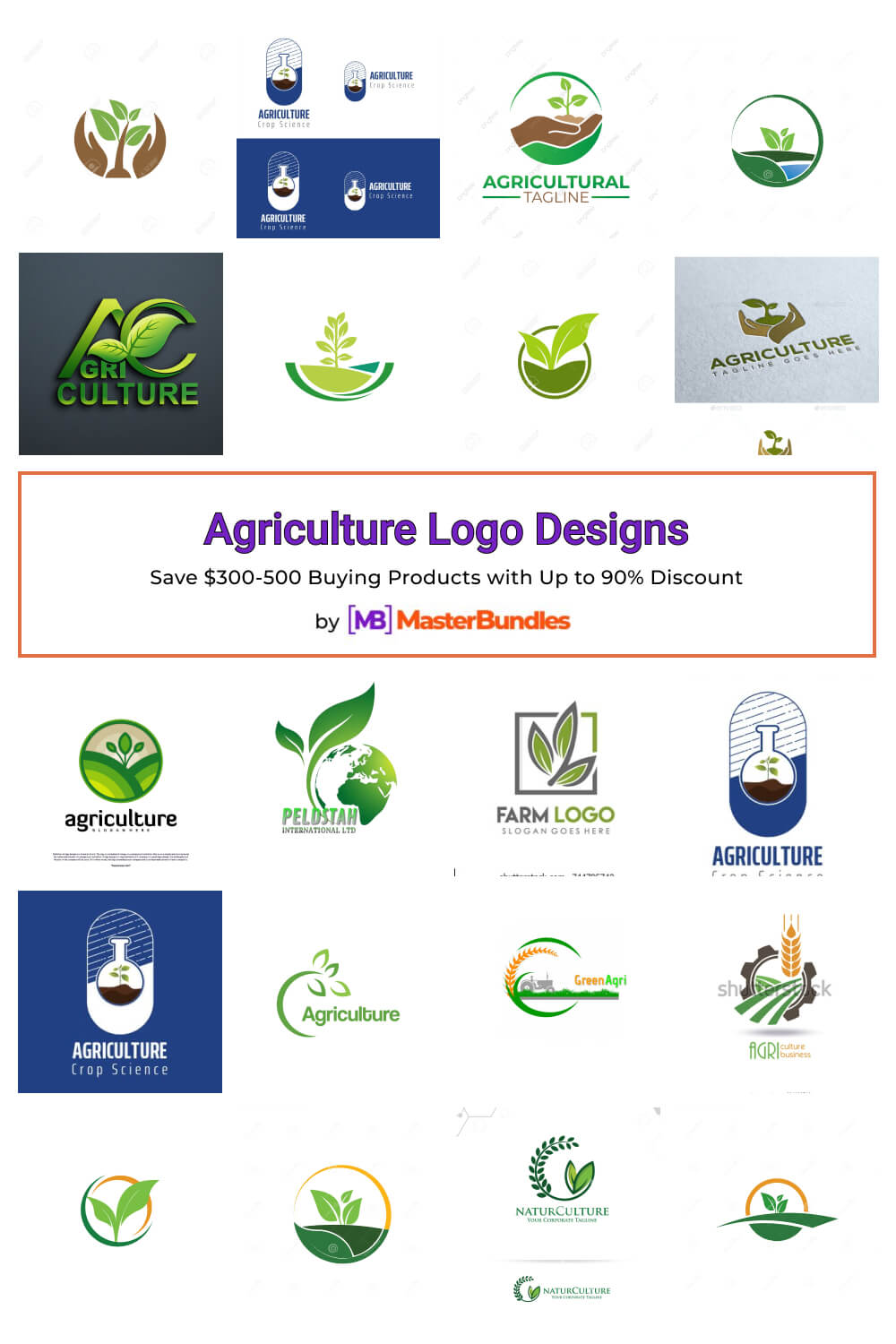
The trucking industry is diverse, serving specialized niches. A logo for agricultural transport will differ from one for construction materials. Tailor the design to resonate with the target audience and reflect the business's nature.
For agricultural transport, imagery like wheat stalks, silos, or rolling fields with earthy tones is appropriate. Construction trucking logos might use cranes, bulldozers, or building materials with a bolder, industrial aesthetic and vibrant colors.
Refrigerated transport companies might use imagery suggesting freshness and temperature control, like snowflakes or ice crystals, with cool color palettes. Understand each niche's unique challenges and opportunities to create a logo that communicates expertise and value.
- Farming: Wheat, silos, earthy tones
- Construction: Cranes, bulldozers, bold colors
- Refrigerated: Snowflakes, ice crystals, cool colors
- Heavy Haul: Strong shapes, metallic tones
Trucking Niche Logo Design Considerations - 2026
| Niche | Common Imagery | Color Palette | Overall Tone |
|---|---|---|---|
| Farming/Agricultural Transport | Silhouettes of crops (wheat, corn), barns, tractors, stylized fields, livestock | Earthy tones – greens, browns, golds, deep reds. Blues can represent water for irrigation. | Reliable, grounded, trustworthy, emphasizing connection to the land and fresh produce. |
| Construction/Heavy Equipment Transport | Heavy machinery outlines (excavators, cranes), stylized road construction elements, strong geometric shapes | Bold colors – oranges, yellows, blacks, grays. Accents of safety-focused reds. | Strong, durable, powerful, conveying safety and the ability to handle demanding jobs. |
| Heavy Haul/Oversized Load | Illustrations of oversized loads, flatbeds, strong lines suggesting weight and stability, abstract representations of movement | Deep blues, grays, and blacks to convey strength and professionalism. Accents of bright yellow or orange for visibility. | Professional, dependable, specialized, highlighting expertise in complex transport. |
| Refrigerated Transport | Snowflakes, stylized refrigeration units, images of fresh produce, temperature gauges | Cool blues, whites, and silvers to represent temperature control. Greens can suggest freshness. | Clean, efficient, trustworthy, emphasizing the preservation of goods and temperature sensitivity. |
| Dry Goods/General Freight | Abstract representations of packages, routes, or global connections. Stylized truck silhouettes. | Versatile – blues, grays, reds, and greens. Often a combination of two or three colors. | Efficient, dependable, broad in scope, conveying a wide range of transport capabilities. |
| Livestock Transport | Silhouettes of livestock (cattle, horses), barn imagery, open road scenes | Browns, greens, and reds to evoke a rural and natural feel. Blues can represent open skies. | Responsible, caring, reliable, emphasizing the safe and humane transport of animals. |
| Flatbed Transport | Illustrations of flatbed trucks carrying diverse cargo, strong lines suggesting stability, road networks | Grays, blacks, and blues to convey strength and professionalism. Accents of brighter colors to represent the variety of cargo. | Versatile, adaptable, reliable, highlighting the ability to transport a wide range of materials. |
Illustrative comparison based on the article research brief. Verify current pricing, limits, and product details in the official docs before relying on it.
Working with a Design Agency: What to Expect
When working with a design agency, provide a detailed brief outlining your company’s values, target audience, and design preferences. Include examples of logos you like (and dislike) with explanations. More information helps the agency understand your vision.
The logo design process typically involves several stages: initial concept development, refinement based on your feedback, and finalization of the design. Expect multiple rounds of revisions as the agency explores different options and incorporates your input. Clear and concise communication is essential throughout this process.
Don't hesitate to ask questions. What file formats will you receive? What are the agency’s policies regarding revisions and ownership? What is their experience designing logos for the trucking industry specifically? A reputable agency will be happy to answer your questions and address any concerns you may have.
- Briefing: Provide detailed information about your company and design preferences.
- Concept Development: The agency presents initial logo concepts.
- Refinement: You provide feedback and the agency refines the designs.
- Finalization: The final logo files are delivered.
Looking Ahead: Logo Trends for 2026
Predicting design trends is always a bit of a guessing game, but I anticipate we'll see continued experimentation with 3D elements and subtle animation in logo design. These effects can add depth and visual interest, but they need to be used judiciously to avoid looking gimmicky.
Sustainability will likely become an increasingly important theme, with companies incorporating eco-friendly imagery and color palettes into their logos. This reflects a growing awareness of environmental issues and a desire to project a responsible brand image. I also foresee a rise in the use of abstract shapes and patterns, moving away from literal representations.
Emerging technologies like AI-powered logo generators will undoubtedly play a role, but I believe the human touch will remain essential. While AI can be a useful tool for generating ideas, it lacks the creativity and strategic thinking of a skilled designer. The best logos will likely be those that combine the power of AI with the expertise of a human professional.
No comments yet. Be the first to share your thoughts!