
Construction & Trucking: A Branding Shift
For decades, construction and trucking industries favored branding that shouts – bold eagles, muscular fonts, and imagery meant to convey strength and power. In 2026, we're seeing a significant shift toward minimalist logo designs. This trend is growing because of evolving customer expectations and a desire to project stability.
Historically, these industries equated visual aggression with trustworthiness. A logo needed to look strong to be seen as reliable, with classic depictions of heavy machinery or determined drivers. However, the market is changing. Clients and partners now prioritize companies that appear dependable, efficient, and forward-thinking—qualities a minimalist aesthetic communicates more effectively.
This shift redefines strength, rather than abandoning it. The old style can feel dated, even abrasive, to a new generation of clients. Businesses realize a subtle, sophisticated logo conveys more confidence than a loud one. This responds to a broader cultural desire for authenticity and a rejection of overly-hyped marketing.
Foresight Creative sees this trend firsthand, with more clients in these sectors requesting designs that prioritize clarity and simplicity. They want to signal they’re not just capable of handling a job, but that they’re a safe, reliable partner. This is a smart move in competitive markets.
The Rise of 'Quiet Strength'
Minimalist branding is a psychological strategy. Simplicity, executed well, builds trust. A cluttered or overly-complex logo can feel untrustworthy, suggesting a lack of focus or an attempt to hide something. A clean, uncluttered design conveys confidence and transparency.
This principle works in other industries. Apple built a global empire on minimalist design. Their products are functional and aesthetically pleasing, communicating quality and innovation. Everlane, the clothing brand, cultivated a loyal following by emphasizing radical transparency and a minimalist aesthetic.
This concept of 'quiet strength' is relevant to construction and trucking. These industries require competence and dependability. A minimalist logo subtly embodies these qualities. It suggests a company confident enough in its abilities to let its work speak for itself.
This trend aligns with broader cultural shifts toward authenticity and a rejection of excessive consumerism. People are increasingly drawn to brands that are genuine, ethical, and environmentally conscious. Minimalism visually represents these values.
Minimalism in Practice: Construction Logos
In construction, minimalist logos typically feature a restrained color palette – earth tones, grays, and muted blues. These colors evoke stability, reliability, and trustworthiness. Font choices lean toward clean, sans-serif typefaces that are easy to read and convey modernity. Iconography often involves geometric shapes representing buildings, foundations, or essential tools.
BuildRight Contractors recently rebranded, moving from a logo featuring a cartoonish hammer to a simple, geometric representation of a building foundation in deep charcoal gray. This change elevated their brand image, making them appear more professional and sophisticated. Stonehaven Construction adopted a logo using a minimalist line drawing of a house, paired with a clean, modern font.
Apex Building Solutions' logo is a simple, upward-pointing triangle in muted blue, symbolizing growth and stability. Landmark Development uses a gray-scale logo focusing on a stylized "L" shape, representing solid foundations.
What sets these logos apart is their ability to communicate a clear message without unnecessary clutter. They differentiate these companies from competitors who still rely on outdated, overly-aggressive imagery. These minimalist designs appeal to modern clients who value professionalism, efficiency, and a commitment to quality.
- BuildRight Contractors: Geometric foundation representation in charcoal gray.
- Stonehaven Construction: Minimalist line drawing of a house.
- Apex Building Solutions: Upward-pointing triangle in muted blue.
- Landmark Development: Stylized "L" shape in gray-scale.
- Nova Structures: Bold line representing a beam with a clean sans-serif font.
Modern Branding Elements
- Geometric Shapes - Clean lines and simple geometric forms (squares, triangles, circles) are replacing detailed illustrations, conveying strength and precision.
- Monogram Logos - Combining initials offers a sophisticated, compact design suitable for vehicle branding and workwear, like those seen with Caterpillar.
- Bold, Sans-Serif Typography - Fonts like Montserrat, Open Sans, and Roboto are favored for their readability and modern aesthetic, mirroring the design choices of Komatsu.
- Limited Color Palettes - Two or three-color schemes, often incorporating shades of blue (trust), gray (reliability), or orange (energy), are becoming standard, as exemplified by Volvo Construction Equipment.
- Negative Space Integration - Clever use of negative space to create secondary imagery within the logo adds visual interest without clutter, a technique increasingly seen in transport logos.
- Iconic Symbolism - Abstract representations of core services (e.g., a stylized road for trucking, a building block for construction) are replacing literal depictions.
- Flat Design Principles - Avoiding gradients, shadows, and excessive effects creates a clean, versatile logo that scales well across various applications – from business cards to large vehicle wraps.
Trucking & Logistics: Streamlining Identity
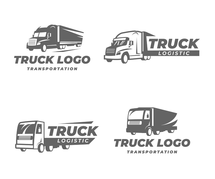
For the trucking and logistics industry, minimalism translates to conveying efficiency, reliability, and safety. Logos in this sector are often simplified to ensure legibility at a distance – crucial when appearing on vehicle livery. Color palettes tend towards blues and grays, again emphasizing trust and dependability, but sometimes incorporating bolder accents like orange or red to signal action and speed.
TransPort Logistics recently redesigned their logo to feature a streamlined graphic of a highway merging into a single point, rendered in a deep navy blue. This logo conveys a sense of forward momentum and efficiency. Similarly, SwiftHaul Trucking adopted a logo consisting of a simple, stylized truck silhouette in a muted gray, paired with a bold, sans-serif font.
Another strong example is Global Freight Solutions, whose logo consists of a clean, geometric representation of a globe, symbolizing their international reach. Prime Movers utilizes a minimalist design featuring a stylized "P" inside a circular shape, evoking a sense of continuous movement. And finally, RoadRunner Express rebranded with a simplified logo of a stylized bird in flight, conveying speed and agility.
These logos aren’t just aesthetically pleasing; they’re strategically designed to reflect the company’s values and services. They project a more professional and tech-forward image, which is increasingly important in a competitive market. The legibility of these logos on vehicles is also a key consideration, ensuring brand recognition on the road.
- TransPort Logistics: Streamlined highway graphic in navy blue.
- SwiftHaul Trucking: Stylized truck silhouette in muted gray.
- Global Freight Solutions: Geometric representation of a globe.
- Prime Movers: Stylized "P" inside a circular shape.
- RoadRunner Express: Simplified bird in flight.
Beyond the Logo: Brand Consistency
A minimalist logo is just the starting point. It's essential to maintain brand consistency across all touchpoints – website design, marketing materials, vehicle livery, uniforms, and even social media profiles. A cohesive brand identity reinforces the message of professionalism and reliability.
Inconsistency creates confusion and erodes trust. If your logo communicates simplicity and efficiency, but your website is cluttered and difficult to navigate, you’re sending mixed signals. Every element of your brand should work together to create a unified and memorable experience.
Developing a comprehensive brand style guide is crucial. This document should outline your logo usage guidelines, color palette, typography, imagery style, and overall brand voice. A style guide ensures that everyone in your organization is on the same page and that your brand is consistently represented.
We often advise clients to think of their brand as a living organism – it needs to be nurtured and maintained to thrive. Consistency is key to building brand recognition and fostering long-term customer loyalty.
Color Psychology: What Works in 2026
Color choices are critical in logo design, and the trends for 2026 lean towards colors that evoke trust, stability, and sustainability. In both the construction and trucking industries, we’re seeing a move away from the bolder, more aggressive palettes of the past. Blues, in particular, are incredibly popular, as they are universally associated with trustworthiness and reliability.
Grays are also prominent, conveying a sense of sophistication and neutrality. They’re often used as a base color, providing a solid foundation for other colors. Earth tones, such as browns and greens, are gaining traction as companies emphasize their commitment to sustainability and environmental responsibility. According to a report by Pantone, earthy shades are expected to be dominant in design trends throughout 2026.
Interestingly, we’re also seeing a strategic use of muted oranges and yellows as accent colors. These colors can convey energy and optimism, but they’re used sparingly to avoid overwhelming the overall aesthetic. The key is to create a balanced and harmonious color palette that reflects the company’s values and target audience.
It's important to note that color psychology is subjective and can vary across cultures. However, these general trends provide a solid foundation for creating a logo that resonates with your target audience and effectively communicates your brand message.
Color Choices for Construction/Trucking Logos
| Color | Associations | Best Uses | Potential Pitfalls |
|---|---|---|---|
| Blue | Trust, reliability, stability, professionalism | Logos aiming to convey dependability, especially in logistics or financial aspects of trucking/construction. Suitable for companies emphasizing technology or innovation. | Can sometimes appear cold or distant if not balanced with warmer tones. Overuse can feel generic. |
| Gray | Neutrality, sophistication, strength, industrial feel | Excellent for construction companies, conveying a sense of solidity and modern efficiency. Works well for brands wanting a sleek, understated look. | May lack vibrancy and can appear dull if not paired with a bolder accent color. Can sometimes be perceived as lacking energy. |
| Green | Growth, safety, sustainability, environmental consciousness | Increasingly relevant for companies highlighting eco-friendly practices or sustainable building/transportation solutions. Suitable for landscaping or environmentally focused construction. | Can be associated with inexperience if not used carefully. May not immediately convey strength or power. |
| Orange | Energy, enthusiasm, confidence, approachability | Effective for attracting attention and conveying a sense of dynamism. Suitable for trucking companies wanting to project a friendly, reliable image. | Can be overwhelming if overused. May not be the best choice for brands aiming for a highly sophisticated or luxurious feel. |
| Black | Power, prestige, sophistication, authority | Conveys strength and reliability, particularly suitable for heavy construction or specialized trucking services. Creates a premium feel. | Can appear intimidating or overly serious if not balanced with other colors. May not be ideal for brands wanting a more approachable image. |
| White | Cleanliness, simplicity, modernity, efficiency | Often used as a background color to emphasize other elements. Conveys a sense of clarity and precision. | Can lack impact when used as the primary color. Requires strong contrast with other elements to be effective. |
Illustrative comparison based on the article research brief. Verify current pricing, limits, and product details in the official docs before relying on it.
Need a clean and modern logo?
— logo_artist07 (@Supan80979759) April 12, 2026
I create minimalist logo designs with:
• Simple & unique concept
• Vector/source files
Hire me on Fiverr https://t.co/MVqRTbx0cF#modernlogo #vectorlogo #customlogo #businesslogo #monogramlogo #minimalistlogo #submarklogo #letterlogo #logomaker
Future-Proofing Your Brand
Minimalist designs are inherently adaptable, which contributes to their longevity. A clean, simple logo is less likely to become dated than a complex, trendy one. However, it’s still important to consider scalability and ensure your logo looks good across various platforms and sizes.
As emerging technologies like AI-powered logo generators become more prevalent, it’s crucial to invest in a truly unique and well-designed logo. These tools can create generic designs, but they often lack the strategic thinking and creative expertise that a professional designer brings to the table.
Staying ahead of the curve requires continuous monitoring of design trends and a willingness to adapt. But remember, the core principles of good design – clarity, simplicity, and relevance – remain constant. A well-designed minimalist logo isn’t just a visual asset; it’s an investment in your brand’s future.
Ultimately, the goal is to create a logo that accurately reflects your company’s values, resonates with your target audience, and stands the test of time. By embracing minimalism and prioritizing brand consistency, you can build a strong, enduring brand that sets you apart from the competition.


No comments yet. Be the first to share your thoughts!