
The 2026 logo design landscape
The graphic design world is shifting away from the hyper-digital gloss of the 2010s. By 2026, the most effective brand marks are returning to simplicity, drawing on heritage aesthetics while remaining functional across digital and physical touchpoints. This isn't about nostalgia for nostalgia's sake; it is a strategic move toward clarity and longevity.
Brands are stripping away unnecessary gradients, complex shadows, and overly intricate details. The goal is a mark that reads instantly on a mobile app icon and remains legible when printed on a tote bag. This approach balances character with utility, ensuring the logo serves the business rather than distracting from it.
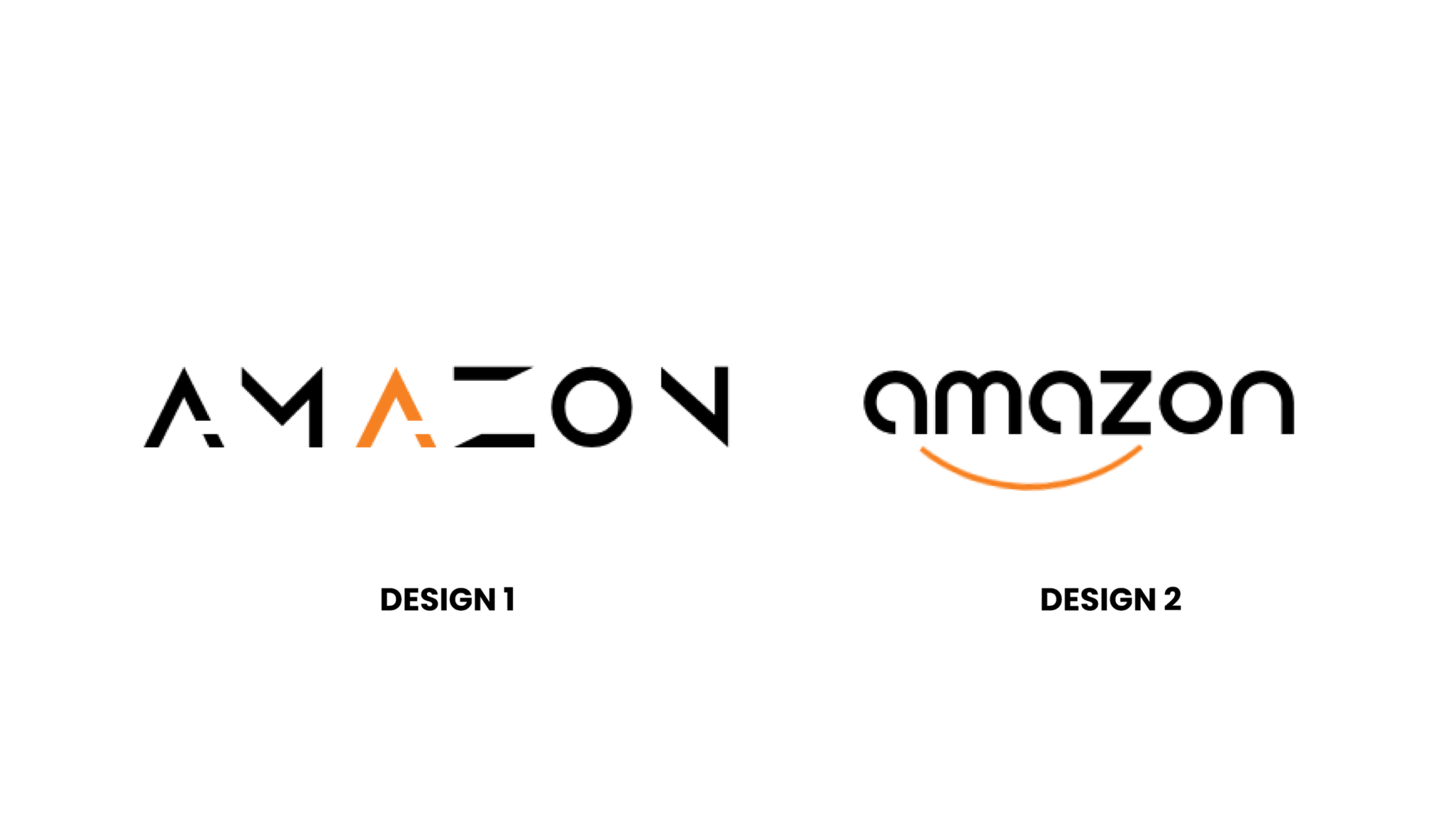
Minimalist geometry takes center stage
Clean lines and reduced complexity are the primary drivers in modern logo design. As digital interfaces become more crowded, brands are stripping away ornamental details to create marks that remain legible at any scale. This shift toward minimalist geometry isn't just aesthetic; it's a functional necessity for the digital-first world.
Why simplicity wins
Minimalist logos rely on basic geometric shapes—circles, squares, and triangles—to convey brand identity. These forms are instantly recognizable and easy to reproduce across various media. A simple geometric mark scales effortlessly from a mobile app icon to a billboard, maintaining its integrity without losing detail. This scalability reduces production costs and ensures consistency across all touchpoints.
Real-world examples
Consider the logos of major tech companies like Apple and Google. Both use simple geometric forms that are instantly recognizable. The Apple logo, a bitten apple, uses clean curves and negative space to create a memorable mark. Similarly, Google’s logo uses simple, colorful letters that are easy to read and reproduce. These examples show how minimalist geometry can create powerful brand identities.
Designing for the future
When designing a minimalist geometric logo, focus on clarity and simplicity. Avoid unnecessary details that can clutter the design. Use high-contrast colors to ensure visibility. Test your logo at different sizes to ensure it remains legible. By prioritizing scalability and digital-first application, you can create a logo that stands the test of time.
Vintage typography meets modern layouts
This trend pairs classic serif or script fonts with contemporary, flat design principles to create a sense of trust and timelessness. It is not about copying the past, but rather using historical weight to anchor a modern brand identity. The result is a logo that feels established and reliable, even if the company is brand new.
The visual contrast is the main driver here. Heavy, traditional typefaces carry inherent authority, while the minimalist layout prevents the design from feeling dated or cluttered. By stripping away gradients and drop shadows, designers ensure the logo scales well across digital platforms while retaining its typographic character. This approach works particularly well for brands in finance, law, or heritage goods that need to signal stability without appearing old-fashioned.
A successful execution requires careful balance. The serif or script element must be legible at small sizes, which often means simplifying the letterforms. The surrounding layout should remain clean, allowing the typography to stand out as the primary focal point. This fusion creates a visual language that is both sophisticated and accessible.
Dynamic and adaptive brand marks
Static logos are becoming less common for brands that operate across diverse digital environments. Dynamic and adaptive brand marks change based on context, such as time of day, location, or user interaction. This approach supports the creative foresight strategy by allowing a single visual identity to remain relevant as platforms and user behaviors shift.
Instead of a fixed image, these systems use generative rules. A brand might adjust its color palette based on local weather data or simplify its geometry for smaller mobile screens. This flexibility reduces the need for endless logo variations while maintaining a cohesive core identity. The result is a brand that feels alive and responsive rather than rigid.
This trend is particularly useful for technology companies and digital-first services. By embedding adaptability into the logo, these brands signal that they are modern and forward-thinking. It demonstrates a commitment to user experience over static tradition.


As an Amazon Associate, we may earn from qualifying purchases.
How Foresight Creative executes these trends
Foresight Creative is a leading design agency specializing in modern, minimalist, and vintage logo designs. They do not simply apply a template to your brand; they interpret these 2026 trends through a lens of strategic clarity. Their approach to creative foresight avoids the exhaustion of chasing fleeting aesthetics, offering flexible solutions that adapt as your market evolves.
For businesses seeking a unique identity, the agency bridges the gap between historical charm and digital necessity. Whether you need a retro badge that feels timeless or a geometric mark that scales perfectly on mobile screens, their portfolio demonstrates a deep understanding of visual language. This expertise ensures your logo remains relevant long after the initial launch.


As an Amazon Associate, we may earn from qualifying purchases.
Their process starts with understanding your industry’s specific context. By focusing on the core message rather than just the visual style, they create assets that communicate value instantly. This method is particularly effective for brands that need to stand out in crowded digital marketplaces without sacrificing professional credibility.
No comments yet. Be the first to share your thoughts!