
The Resurgence of Nostalgia: Why Vintage Logos Are Back
There’s a clear shift happening in logo design for 2024: a strong move towards vintage aesthetics. We're seeing clients across several industries actively requesting designs that evoke a sense of history and authenticity. This moves away from the hyper-modern, sleek looks that dominated the previous few years, reflecting a reaction to the increasingly digital and often impersonal world.
This isn’t just a superficial trend. This connects to a broader cultural desire for things that feel real and lasting. People are drawn to imagery that reminds them of simpler times, or of brands with established legacies. That’s why we’re seeing a surge in demand for logos that incorporate classic typography, retro color palettes, and hand-drawn elements. Think of brands like Stetson, whose logo hasn’t drastically changed in decades – that kind of enduring image is what people respond to.
Vintage logos are inherently memorable. They often use design elements less common in contemporary branding, helping them stand out. While modern design isn't 'out,' brands recognize the value of a design that feels both familiar and distinctive—a paradox of standing out by looking back.
Minimalism’s Continued Reign: Less is Still More
Despite the rise of vintage styles, minimalism isn’t going anywhere. It remains a powerfully effective approach to logo design in 2024. The core principles – simplicity, clarity, and a focus on essential elements – continue to resonate with businesses across all sectors. A well-executed minimalist logo is instantly recognizable and conveys a sense of sophistication and confidence.
The strength of minimalist design lies in its versatility. A simple logo translates beautifully across different platforms, from business cards and websites to social media profiles and product packaging. Unlike more complex designs, it doesn’t lose its impact when scaled down or displayed in different formats. We've seen this consistently with our clients in the interior design space; a clean, simple logo communicates sophistication and a focus on quality.
Furthermore, minimalist logos are incredibly memorable. By stripping away unnecessary clutter, they create a visual impact that’s hard to ignore. This approach makes a statement with the fewest possible elements—a challenging but rewarding endeavor. The goal is to identify the brand's core essence and represent it in its purest form.
Color Palettes: Earth Tones and Muted Brights
Color significantly shapes brand perception, and the palettes dominating logo design in 2024 reflect a desire for authenticity and naturalness. We’re seeing a significant increase in the use of earth tones – terracotta, olive green, beige, and warm browns – which evoke feelings of stability, trustworthiness, and connection to the environment.
Earth tones aren't the only players, however. Muted brights are also gaining traction. Think dusty rose, sage green, and faded blues. These colors offer a pop of visual interest without being overly jarring or artificial. They provide a nice balance between the grounding effect of earth tones and the energy of brighter hues.
Designers are pairing these palettes with neutral backgrounds—creams, off-whites, and grays—to create a sense of calm and sophistication. The overall effect is a logo that feels both modern and timeless.
- Terracotta: Warm, inviting, earthy
- Olive Green: Natural, sophisticated, calming
- Beige: Neutral, versatile, understated
- Dusty Rose: Soft, feminine, vintage-inspired
- Sage Green: Calming, natural, sophisticated
2024 Logo Design Color Palette Decision Matrix
| Color Palette | Brand Personality Associations | Industry Suitability | Current Trend Score |
|---|---|---|---|
| Earth Tones | Trustworthy, Natural, Authentic, Calming | Farming, Interior Design, Food & Beverage, Wellness | High |
| Muted Brights | Playful, Approachable, Creative, Modern | Fashion, Tech Startups, Creative Agencies, Lifestyle Brands | Medium-High |
| Bold Primary Colors | Confident, Energetic, Classic, Authoritative | Construction, Trucking, Finance, Established Brands | Medium |
| Gradients | Innovative, Dynamic, Futuristic, Modern | Tech, Fashion, Digital Art, Entertainment | Medium |
| Monochrome (Black & White) | Sophisticated, Minimalist, Timeless, Powerful | Fashion, Interior Design, Luxury Goods, Tech | High |
| Pastel Shades | Gentle, Feminine, Delicate, Youthful | Fashion, Beauty, Children's Products, Lifestyle | Medium |
| Warm Neutrals (Beige, Cream) | Comforting, Reliable, Elegant, Understated | Interior Design, Wellness, Food, Hospitality | Medium-High |
Illustrative comparison based on the article research brief. Verify current pricing, limits, and product details in the official docs before relying on it.
Typography Trends: Serifs Make a Statement
Sans-serif fonts have long been favored in logo design for their clean lines and modern aesthetic. However, 2024 is witnessing a notable shift: the comeback of serif fonts, particularly those with a vintage or classic feel. This trend connects directly into the broader resurgence of nostalgia.
Serif fonts, with their small decorative strokes, convey a sense of tradition, authority, and refinement. They instantly add a touch of elegance and sophistication to a logo. Using more serifs for farming clients conveys tradition, reliability, and a connection to the land. This is a subtle but powerful way to communicate brand values.
However, this doesn't mean abandoning sans-serif fonts altogether. The strategy is to use typography strategically. Pairing a serif headline font with a clean sans-serif body font can create a beautiful contrast and visual hierarchy. The right typography choice depends on the specific brand and its message.
Industry-Specific Applications: What's Working Where
These trends aren’t applied uniformly across all industries; each sector has unique considerations and preferences. For Interior Design, minimalist logos continue to dominate, emphasizing elegance, sophistication, and a focus on clean lines. Think muted color palettes and refined serif fonts.
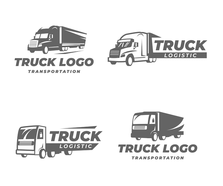
In the Trucking industry, we’re seeing a revival of vintage-inspired logos, often incorporating bold typography and imagery reminiscent of classic Americana. These logos convey a sense of strength, reliability, and a connection to the open road. They need to be impactful and easily recognizable from a distance.
Farming and Agricultural brands are leaning heavily into rustic and earthy aesthetics. Logos often feature hand-drawn illustrations, warm color palettes, and serif fonts that evoke a sense of tradition and authenticity. A logo for a local farm should feel approachable and down-to-earth.
For Construction companies, logos need to project strength, reliability, and trustworthiness. We’re seeing a preference for bold, geometric designs and strong color palettes – often blues, grays, and oranges. Logos need to inspire confidence and convey a sense of stability.
Finally, Fashion brands have the most flexibility. They can experiment with a wider range of styles, from minimalist and elegant to bold and playful. The key is to create a logo that’s versatile enough to adapt to changing trends while still remaining true to the brand’s identity.
Circular Logos and Monograms: A Timeless Appeal
Circular logos and monograms remain popular in 2024. These shapes are visually appealing and create a sense of completeness and unity. They also work well in various contexts, from social media profile pictures to product labels.
The circular shape easily incorporates into both minimalist and vintage designs. A simple, clean circle with a stylized monogram is a classic minimalist approach. Alternatively, an ornate circle with intricate illustrations and vintage typography evokes history and craftsmanship.
These logos work particularly well for brands wanting to project community or wholeness. The circular shape symbolizes interconnectedness and inclusivity. They are also very versatile for merchandise—think stamps, stickers, or patches.
Brands Mastering Circular Logos & Monograms
- Adidas - The three stripes are instantly recognizable, often contained within a circular or elliptical shape in their branding. This reflects their commitment to athletic performance and a dynamic, forward-moving energy. Adidas Official Website
- Target - The iconic red bullseye is a prime example of a circular logo that’s both simple and memorable. It communicates accuracy, directness, and accessibility, fitting their brand as a value-oriented retailer. Target Official Website
- BMW - While often associated with their wordmark, BMW’s circular logo, representing a rotating propeller, is a key part of their brand identity. It subtly nods to their origins in aircraft engine manufacturing, conveying engineering precision and a sense of motion. BMW Official Website
- Lacoste - The Lacoste crocodile within a circle is a classic example of a monogram-style circular logo. It represents elegance, sport, and a sophisticated lifestyle, embodying the brand’s heritage in tennis apparel. Lacoste Official Website
- Starbucks - The Starbucks siren, originally inspired by a 16th-century woodcut, is contained within a circular frame. The circular design and the mythical figure evoke a sense of tradition, storytelling, and a welcoming atmosphere. Starbucks Official Website
- Audi - The four interlocking rings of Audi are visually contained within an implied circle. This design symbolizes the merger of four previously independent automobile manufacturers, representing unity and technological advancement. Audi Official Website
- Mitsubishi - The three-diamond emblem of Mitsubishi is often presented within a circular frame. This represents the crests of the Iwasaki family and the Tosa clan, signifying reliability, strength, and a long-standing heritage. Mitsubishi Official Website
3D and Subtle Gradients: Adding Depth Without Clutter
While minimalism emphasizes simplicity, designers add depth and visual interest without sacrificing the clean aesthetic. Subtle 3D effects and gradients are increasingly popular. These techniques create dimension and realism, making a logo feel more tangible and engaging.
However, the key word is subtle. Overly dramatic 3D effects or garish gradients can overwhelm a minimalist design. The goal is to add depth without creating clutter,
It's easy to overdo it, so restraint is crucial. Gradients should be used purposefully to highlight specific elements or create a sense of movement. When used effectively, they can elevate a minimalist logo from flat and static to dynamic and engaging.
Animal-Inspired Logos: Wolves, Eagles, and Beyond
Animal imagery continues to be a powerful tool in logo design, and certain animals consistently resonate with brands across various industries. Wolves and eagles remain particularly popular choices, representing strength, freedom, wisdom, and leadership.
The symbolism associated with these animals is deeply ingrained in our collective consciousness. Wolves evoke a sense of loyalty, intelligence, and wildness, while eagles represent power, vision, and courage. However, it’s important to avoid clichés. A generic wolf or eagle logo can easily fall flat.
We’ve done some really interesting work with this for sports teams, creating unique and stylized animal illustrations that capture the spirit of the team. The key is to move beyond simplistic representations and create designs that are both visually striking and meaningful. It's about finding a fresh perspective on familiar imagery.
Minimalist Logo Design Tutorial: From Sketch to Vector (Animal Icon)
Foresight Creative Studio
Watch on YouTube →

No comments yet. Be the first to share your thoughts!