
The Shift: Why Bold Logos Are Losing Ground in Construction & Trucking
For decades, the construction and trucking industries have favored logos that project strength, reliability, and a sense of established power. Think bold fonts, detailed imagery – often cranes, hammers, or semi-trucks – and a generally "busy’ aesthetic. But something is changing. We’re seeing a noticeable shift toward minimalist logo designs in both sectors, and it"s more than just a fleeting trend.
I think it’s easy to dismiss this as simply "following what’s popular," but there's a deeper reasoning at play. The broader design world has been moving toward simplicity for years, influenced by Scandinavian design, tech companies, and a general desire for clarity in a visually saturated world. What was once considered avant-garde is now becoming the standard, and traditionally "masculine" industries are taking notice.
Older logo styles can start to feel dated, even cumbersome. They lack the immediate impact and versatility needed in today’s fast-paced market. A logo that worked twenty years ago might now appear cluttered and less memorable. The visual noise distracts from the core message. This isn’t about abandoning strength; it’s about communicating it in a more effective way.
Dribbble’s “Best Shots of 2026” highlight this trend, showing a clear preference for clean lines and impactful simplicity across various industries – including those traditionally resistant to change. This suggests the shift isn't just within our observation; it’s being recognized by design professionals globally.

Minimalism's Appeal: Clarity and Memorability on the Road and Jobsite
The power of a minimalist logo lies in its ability to communicate instantly. This is especially crucial in industries like construction and trucking, where branding often appears on vehicles, heavy machinery, and even hard hats – environments where quick recognition is paramount. A complex logo gets lost in the details; a simple one cuts through the clutter.
Think about a truck speeding down the highway. A driver has milliseconds to register a logo. A clean, iconic design is far more likely to be processed and remembered than something intricate. The same applies to a construction site, a visually chaotic environment where clear signage and identifiable branding are essential for safety and organization.
Beyond visibility, minimalism conveys trustworthiness and efficiency. A streamlined design suggests a company that is organized, modern, and focused on delivering quality work. It’s a subtle but powerful message. I believe customers respond positively to this sense of competence.
A minimalist approach isn’t about removing elements arbitrarily. It’s about carefully considering what to remove to amplify the message. It’s about distilling a brand’s essence into its purest form.
- Instant Recognition: Crucial for vehicles and jobsite visibility.
- Conveys Trustworthiness: A clean design implies efficiency and quality.
- Enhanced Memorability: Simpler logos are easier to recall.
- Versatility: Works well across various media and sizes.
Benefits of Minimalist Logos
- Improved Brand Recognition - Simple, uncluttered designs are easier for customers to remember and associate with your company. This is crucial in competitive industries like construction and trucking where visual recall is key.
- Increased Versatility - Minimalist logos translate seamlessly across various applications. From vehicle wraps and hard hats in construction to the sides of trailers and company apparel in trucking, a clean design maintains clarity on any surface.
- Communicates Professionalism & Trust - In sectors demanding reliability like construction and trucking, a minimalist logo projects an image of competence, efficiency, and trustworthiness. It signals a focus on core services rather than flashy aesthetics.
- Easier & More Affordable Reproduction - Fewer details mean lower printing costs and simpler embroidery processes. This is particularly beneficial for companies needing to brand a large fleet of vehicles or numerous pieces of equipment.
- Modern & Timeless Appearance - Minimalist design principles avoid fleeting trends. A well-executed minimalist logo will remain relevant and impactful for years to come, avoiding the need for frequent and costly rebranding.
- Scalable for Digital Use - In today's digital landscape, logos need to look sharp on everything from websites and social media profiles to mobile apps. Minimalist logos scale beautifully without losing definition, ensuring a consistent brand presence online.
- Cost-Effective Design Process - While quality design always warrants investment, minimalist logos often require less design time compared to complex illustrations, potentially reducing overall design costs. This allows businesses to allocate resources to other critical areas.
Construction Logos: From Heavy Machinery to Streamlined Identity
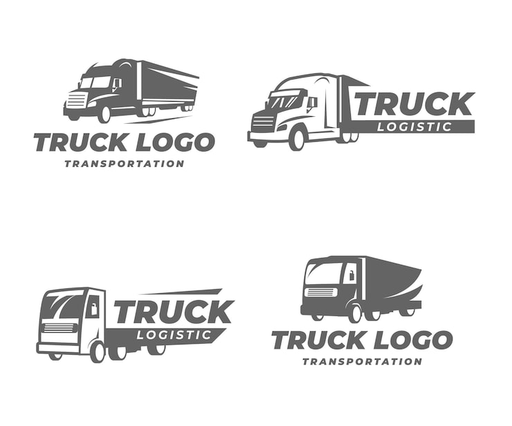
The construction industry is undergoing a fascinating rebranding. We’ve seen a lot of companies move away from literal depictions of cranes, bulldozers, or building facades in their logos. These images, while directly representative of the work, often appear clichéd and lack a sense of sophistication. They can also feel restrictive – what if a company expands into a different area of construction?
Instead, companies are embracing geometric shapes, strong typography, and limited color palettes. For example, a local firm, Apex Construction, recently redesigned their logo from a detailed illustration of a skyscraper to a simple, bold "A’ formed by intersecting lines. This new logo feels more modern, adaptable, and memorable. It’s a significant departure, but it"s been incredibly well-received.
The use of negative space is also becoming increasingly popular. This technique creates visual interest and adds a layer of sophistication. We recently worked with BuildRight Inc. on a logo that incorporates a subtle, abstract representation of a building’s foundation within the negative space of a square. It’s a clever and impactful design.
Color palettes in construction logos are generally leaning towards grays, blacks, and blues – colors that convey stability, strength, and reliability. A pop of orange or yellow can be used as an accent color to add visual energy and highlight a specific element. The key is restraint.
Trucking & Logistics: Building Trust on the Open Road
In the trucking and logistics sector, trust and reliability are paramount. Clients need to know their goods will be delivered safely and on time, and drivers want to work for a company they can depend on. A minimalist logo can powerfully convey these qualities. I'm noticing a trend toward logos that feel 'tech-forward' even for traditional trucking companies.
Legibility is also a critical consideration. Truck logos appear on vehicle wraps, trailers, and in digital advertising – all environments where clarity is essential. A complex logo can become illegible when scaled down or viewed from a distance. A simple, bold design ensures the brand message remains clear.
We’ve observed companies like SwiftLine Logistics moving towards simpler designs featuring clean sans-serif fonts and abstract representations of movement. They’ve moved away from overly detailed illustrations of trucks, opting for a more sophisticated and versatile visual identity. This change reflects a broader effort to modernize their brand and appeal to a wider range of clients.
The design choices also reflect the increasing integration of technology within the trucking industry. Minimalist logos can convey a sense of innovation and efficiency, suggesting a company that is embracing new technologies to improve its services.
Color Psychology: The Subtle Power of Restraint
Color plays a crucial role in reinforcing the minimalist aesthetic. Neutral colors – grays, blacks, and whites – are particularly popular in both construction and trucking logos. These colors convey stability, professionalism, and a sense of timelessness. They act as a solid foundation for the brand identity.
However, a completely monochrome palette can feel sterile. That's where the strategic use of accent colors comes into play. A bold blue can convey trust and reliability, while a vibrant orange can represent energy and innovation. The key is to use accent colors sparingly and purposefully.
I think people underestimate how much color impacts perception. For example, a dark gray paired with a bright safety orange can evoke a sense of both strength and caution – a fitting combination for a construction company. Similarly, a deep navy blue combined with a silver gray can convey trustworthiness and efficiency – ideal for a trucking firm.
The choice of color should always be aligned with the brand’s overall values and target audience. It’s not just about aesthetics; it’s about psychology.
Color Palette Associations for Construction & Trucking Logos (2026 Trends)
| Color Palette | Trustworthiness | Strength | Innovation | Reliability |
|---|---|---|---|---|
| Black & White | Conveys a sense of classic authority and timelessness, suggesting established expertise. | Represents solidity and power, particularly with bold black elements. | Can appear stark and modern, hinting at forward-thinking approaches when used minimally. | High contrast reinforces a feeling of dependability and clear communication. |
| Navy & Gray | Evokes a sense of professionalism, stability, and corporate responsibility. | Navy is associated with authority and resilience; gray adds a grounded, robust feel. | The combination can suggest a sophisticated, technologically advanced approach. | Both colors inspire confidence and a sense of long-term security. |
| Earth Tones (Browns, Greens, Terracotta) | Suggests a connection to the physical world, grounding, and natural durability. | Earthy browns represent robustness and the foundations of construction; greens can imply sustainability. | Can be perceived as traditional, but strategic use can hint at eco-friendly innovation. | Creates a feeling of dependability and a long-lasting, solid presence. |
| Red & Charcoal | Red can signal energy and urgency, while charcoal provides a sophisticated base. | Red is a powerful color associated with strength and action; charcoal adds a sense of resilience. | This pairing can convey a dynamic and modern approach to problem-solving. | Charcoal grounds the energy of red, suggesting a reliable and controlled power. |
| Blue & Silver | Blue fosters trust and security, while silver adds a touch of sophistication and modernity. | Blue is often associated with dependability and stability; silver suggests precision and quality. | The combination can imply technological advancement and a forward-thinking mindset. | Reinforces a sense of professionalism and long-term reliability. |
Illustrative comparison based on the article research brief. Verify current pricing, limits, and product details in the official docs before relying on it.
Beyond the Logo: Extending Minimalism to Brand Guidelines
A minimalist logo is just the starting point. To truly realize the benefits of this approach, it’s essential to extend the minimalist aesthetic to all aspects of the brand identity – website design, marketing materials, social media presence, and even vehicle livery.
Inconsistency can undermine the impact of a well-designed logo. If a company has a sleek, minimalist logo but a cluttered, outdated website, the overall impression will be disjointed and confusing. The brand will lack credibility.
I've seen companies stumble when they don't carry the minimalist aesthetic through their entire brand. A cohesive brand identity creates a sense of professionalism and reinforces the core values of the company. It’s about creating a consistent experience for customers at every touchpoint.
This means carefully considering typography, imagery, and overall layout. Everything should be clean, uncluttered, and focused on conveying a clear message. Minimalism isn’t just a visual style; it’s a philosophy.
Foresight Creative's Approach to Minimalist Logo Design
At Foresight Creative, we specialize in crafting minimalist logos that resonate with our clients’ target audiences. We understand the unique challenges and opportunities presented by the construction and trucking industries, and we tailor our designs accordingly.
Our design process begins with a thorough understanding of the client’s brand values, target market, and competitive landscape. We then explore a range of concepts, focusing on simplicity, clarity, and memorability. We prioritize functionality and scalability, ensuring the logo looks great across all media.
We recently worked with Ironclad Transport, a regional trucking company, to redesign their logo. They wanted a more modern and professional look that would convey reliability and efficiency. We created a minimalist logo featuring a stylized "I" formed by two intersecting lines, representing strength and connection. The client was thrilled with the result.
If you’re considering a logo redesign or are launching a new business, we encourage you to request a consultation. We’ll work with you to create a minimalist logo that effectively communicates your brand message and helps you stand out from the competition. Visit our website or contact us today to learn more.
Need a clean and modern logo?
— logo_artist07 (@Supan80979759) April 12, 2026
I create minimalist logo designs with:
• Simple & unique concept
• Vector/source files
Hire me on Fiverr https://t.co/MVqRTbx0cF#modernlogo #vectorlogo #customlogo #businesslogo #monogramlogo #minimalistlogo #submarklogo #letterlogo #logomaker
Looking Ahead: The Staying Power of Simplicity
The shift towards minimalist logo design in the construction and trucking industries isn't likely a passing fad. The benefits of simplicity – clarity, memorability, and versatility – are too significant to ignore. I suspect we'll see even more experimentation with negative space, typography, and subtle color palettes.
As technology continues to evolve, the need for clear and concise branding will only become more important. Minimalist logos are well-positioned to thrive in this environment, offering a timeless and adaptable solution for businesses of all sizes.

No comments yet. Be the first to share your thoughts!