
Building Confidence: The New Face of Construction Branding
Construction branding used to rely heavily on images of hard hats and steel beams. This showed capability but often missed the mark on trust and innovation. Today, clients and potential employees expect more: a clear commitment to quality, safety, and understanding their needs.
Competition, sustainability concerns, and brand perception are pushing for more sophisticated branding. A modern logo is now essential for building trust and attracting talent. A strong visual identity significantly shapes perception and business success.
The construction industry, once slow to adopt modern marketing, now recognizes the value of a strong brand identity. Clients choose partners who project competence and reliability, not just the lowest bid. This requires investing in professional logo design and a cohesive brand strategy.
The approach is shifting from purely functional to more emotive. Construction companies need to convey not just what they build, but how and why. A well-designed logo is the first step in telling that story.
Beyond Hard Hats: Evolving Visual Cues
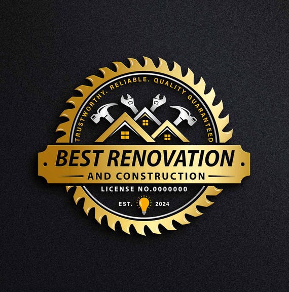
Traditional construction visuals like hard hats and cranes are starting to feel dated. While a subtle nod can work, over-reliance makes a company look uninspired. The shift is towards more abstract and symbolic representations.
Color psychology is important. Blues and greens convey stability, trustworthiness, and nature, fitting for sustainable builders. Oranges and yellows add energy, while grays and blacks suggest sophistication. The right palette aligns with core values.
Typography is changing. Sans-serif fonts offer a clean, modern look that's readable and professional. Bolder fonts are also gaining traction. Overly complex logos are fading; clients want memorable and recognizable designs.
Strategic use of negative space creates sophistication and subtly communicates a brand's message. Well-executed negative space is visually striking and engaging.
- Blues & Greens: Stability, trustworthiness, sustainability
- Oranges & Yellows: Energy, optimism
- Grays & Blacks: Sophistication, strength
- Sans-serif fonts: Clean, modern, readable
Logo Design: Do's & Don'ts
- Do: Employ strong, geometric shapes. Squares, triangles, and bold lines convey stability, precision, and a sense of structure – all vital in construction.
- Do: Utilize a professional color palette. Blues and grays communicate trustworthiness and reliability, while oranges and reds can suggest energy and action, but use sparingly.
- Do: Consider negative space. Clever use of negative space can create memorable and sophisticated logos, subtly hinting at building or structural elements.
- Don't: Overcomplicate the design. A cluttered logo appears unprofessional and is difficult to reproduce across various media (trucks, uniforms, business cards).
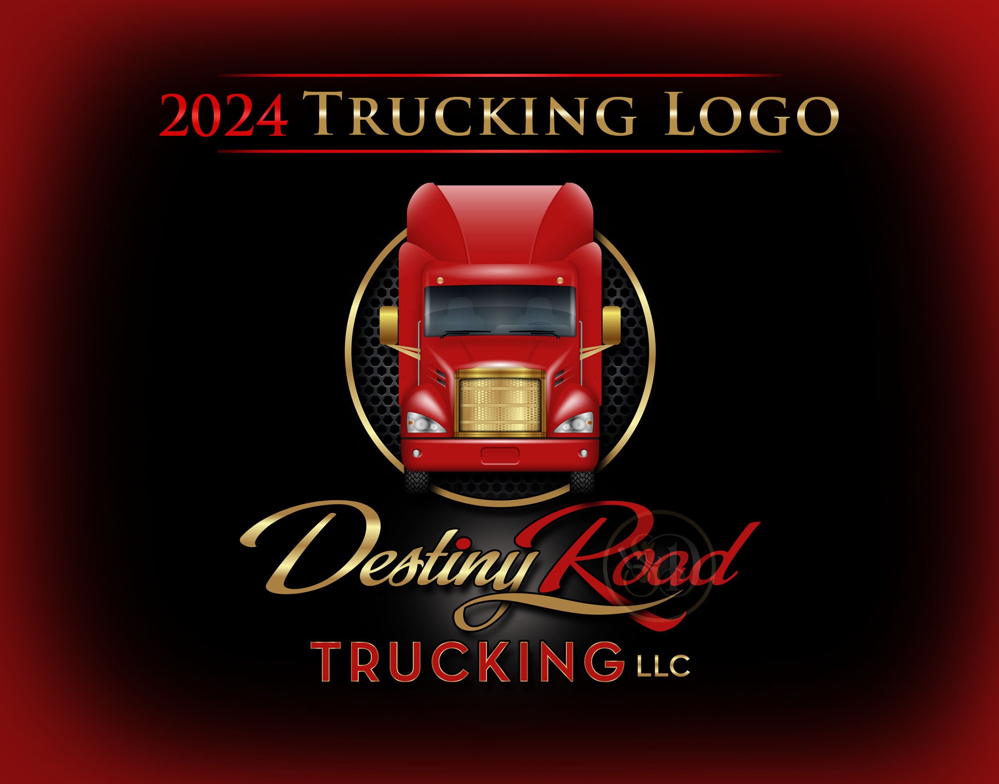
- Don't: Rely on generic stock imagery of construction equipment. While a hard hat or crane *might* seem relevant, they lack originality and fail to differentiate your brand. Aim for abstraction or symbolism.
- Don't: Use overly decorative or script fonts. Construction is about strength and solidity; delicate fonts project the wrong message. Opt for clean, legible sans-serif fonts.
- Do: Ensure scalability. Your logo needs to look good whether it's on a large billboard or a small mobile app icon. Vector-based designs are essential for this.
- Don't: Ignore industry trends, but don’t blindly follow them. Minimalism and clean lines are currently popular, but ensure the design still reflects your company’s unique identity.
Minimalism’s Strength: Less is More for Builders
Minimalist logo design is popular in construction for good reason. In a complex sector, simplicity is effective, conveying confidence, professionalism, and focus on core values. It communicates reliability without being loud.
A minimalist logo removes unnecessary elements, leaving only essentials. This signals efficiency, focus, and commitment to quality. Examples include logos with clean lines, simple shapes, and clear messages.
Minimalism offers benefits beyond aesthetics. These logos are memorable, versatile, and less likely to look dated. They scale well, from billboards to business cards.
Successful minimalist construction logos use strong typography and color palettes, prioritizing clarity and impact over elaborate details. This design philosophy reflects the industry's focus on precision and functionality.
Industry-Specific Approaches: Logos That ‘Speak’ to Clients
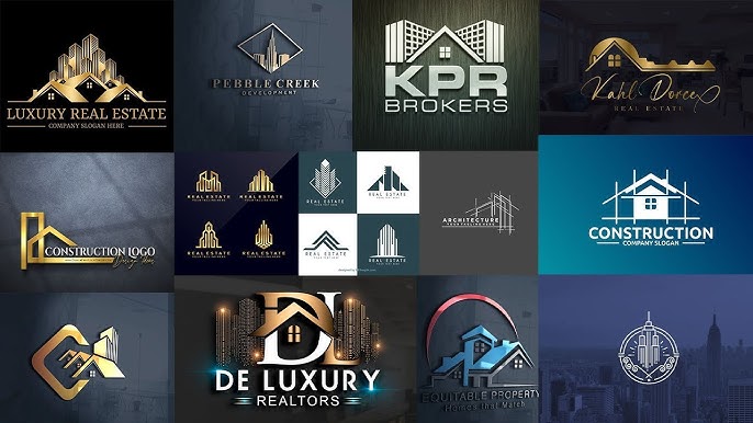
A one-size-fits-all logo approach rarely works in construction. Different industry segments need distinct branding to resonate with their audiences. A residential builder's logo will differ from a heavy civil engineering firm's or a commercial specialist's.
Residential builders benefit from logos evoking warmth, comfort, and quality. Earth tones, elegant typography, and home-related imagery are common, conveying trust and reliability for clients' dream homes.
Commercial construction firms often prioritize logos projecting strength, stability, and innovation. Bold colors, geometric shapes, and modern typography convey competence and professionalism, often emphasizing scale and complex project capabilities.
Infrastructure and heavy civil engineering firms need logos conveying durability, precision, and safety. These logos are often technical, using strong lines and solid shapes. Understanding sector nuances is crucial.
Construction Niche Branding: Logo Style Adaptations for 2026
| Construction Niche | Logo Style | Color Palette | Typography | Imagery |
|---|---|---|---|---|
| Residential Construction | Minimalist | Earthy tones (beige, muted greens, grays) with a possible accent of warm orange. | Clean, sans-serif fonts conveying trustworthiness and approachability. | Abstract house shapes, simple rooflines, or stylized foundations. Focus on conveying 'home' and quality. |
| Commercial Construction | Bold & Modern | Strong blues and grays, potentially incorporating metallic accents (silver, gold) for a premium feel. | Geometric sans-serif fonts, often in heavier weights, projecting strength and reliability. | Abstract representations of skyscrapers, building facades, or structural elements. Emphasis on scale and innovation. |
| Infrastructure Projects | Vintage/Industrial | Deep blues, browns, and aged golds, evoking a sense of history and durability. | Serif fonts with a slightly distressed appearance, or strong, blocky sans-serifs. | Gear motifs, bridge structures, or stylized depictions of heavy machinery. Conveying strength and longevity. |
| Demolition & Excavation (Specialty) | Bold & Dynamic | High-contrast colors like black, red, and yellow to communicate power and action. | Impactful, slightly aggressive sans-serif fonts. | Imagery focusing on controlled demolition, heavy equipment, or abstract representations of impact and force. |
| Interior Fit-Out & Renovation | Minimalist/Elegant | Neutral palettes (whites, creams, grays) with subtle accent colors reflecting current interior design trends. | Lightweight, modern sans-serif or delicate serif fonts. | Abstract shapes suggesting interior spaces, architectural details, or stylized tools of the trade. |
| Sustainable/Green Construction | Natural & Organic | Greens, browns, and blues inspired by nature, emphasizing eco-friendliness. | Rounded, approachable sans-serif fonts or hand-drawn style typography. | Leaf motifs, representations of renewable energy sources, or stylized landscapes. |
Illustrative comparison based on the article research brief. Verify current pricing, limits, and product details in the official docs before relying on it.
Vintage Revival: A Nod to Craftsmanship
While modern minimalism leads, a counter-trend of vintage-inspired logos is emerging in construction. This trend draws inspiration from the past to evoke history, tradition, and craftsmanship, rather than recreating outdated designs.
Vintage elements like classic lettering, hand-drawn illustrations, and muted colors add character and authenticity. This appeals to companies specializing in restoration or historic preservation.
Successfully incorporating vintage elements requires balancing nostalgia with contemporary appeal. A logo that feels too old-fashioned appears dated. The goal is to subtly reference the past without sacrificing a modern aesthetic.
Vintage-style badges, seals, or crests can convey quality and heritage. The aim is to balance nostalgia with contemporary appeal.
Logos in Action: Beyond the Letterhead
A logo's impact extends beyond business cards and websites to vehicle wraps, uniforms, signage, social media, and crew apparel. Logo versatility and scalability are therefore paramount.
A logo must be legible on a small mobile screen as well as a large billboard. It needs to work in color and black and white, and adapt to various backgrounds and materials. Considering these applications is key during the design process.
A branded fleet of vehicles acts as a mobile advertisement, reinforcing brand recognition and trust. Consistent logos on uniforms create a professional image and instill client confidence.
Failing to consider these applications results in a logo that is visually appealing in isolation but ineffective in practice. A successful logo works seamlessly across all touchpoints.
Foresight Creative: Building Brands That Last
Foresight Creative crafts modern, minimalist, and vintage logo designs for the construction industry. We understand the unique challenges and opportunities construction companies face in today's competitive market.
Our process starts with a deep dive into a client's business, target audience, and brand values. We build visual identities that communicate a clear message,
We offer a wide range of logo design services, including 3D and circular logos, as well as designs inspired by sports, money, and animals. We also specialize in industry-specific logo designs, tailoring our approach to meet the unique needs of each sector. We can be found on Pinterest – explore the captivating Foresight Logo designed by Robert Lane.
Our commitment to quality and client satisfaction is unwavering. We believe that a strong brand identity is an investment in the future, and we’re dedicated to helping our clients build brands that last.
Looking Ahead: Logo Trends for 2026
Predicting the future of logo design is always a challenge, but several trends are emerging that are likely to shape the construction industry in the coming years. I suspect we’ll see more experimentation with 3D elements and a continued emphasis on sustainability-focused branding.
We may also see a greater use of motion graphics and animated logos, particularly in digital applications. As technology continues to evolve, logos will need to be more dynamic and engaging to capture attention. It's hard to say for sure, but these are the signals I'm picking up.
A continued emphasis on simplicity and clarity will likely remain a key trend. Clients will continue to demand logos that are memorable, versatile, and easily recognizable. Logos that communicate trust, reliability, and innovation will be in high demand.

No comments yet. Be the first to share your thoughts!