
Moving past basic green
People buy more than just cheap food now. They want brands that share their values. This isn't a niche trend; it's hitting every part of the grocery store, especially the produce and meat aisles.
The demand for ethically sourced, environmentally responsible food is driving a significant change in agricultural branding. Farms are no longer simply selling commodities; they’re selling a story, a promise of responsible land stewardship, and a commitment to healthier food systems. This means branding has moved beyond basic identification to actively communicating values.
However, this increased focus on sustainability also brings the risk of "greenwashing’ – misleading consumers about a product"s environmental benefits. Authenticity is paramount. Consumers are becoming increasingly savvy and can quickly spot insincere marketing. The USDA's role in organic certification, while a starting point, doesn’t encompass all aspects of sustainable agriculture, leaving room for farms to define and communicate their own unique approaches.
Building trust is essential. Farms need to demonstrate genuine commitment through transparent practices and clear communication, and a thoughtfully designed logo is often the first visual touchpoint in establishing that connection. It's a signal to consumers about what the farm stands for.
What a logo says about your soil
Traditionally, a farm’s logo served a primarily functional purpose: identifying the source of the food. They often included the family name, the primary crops grown, or the geographic location. These logos were often simple, straightforward, and focused on conveying basic information. Think of older designs featuring blocky lettering and illustrations of the farm itself.
Today, while still providing identification, logos are increasingly used to signal values. A farm logo is now expected to communicate not just what is produced, but how it’s produced – whether through organic practices, a commitment to animal welfare, or a dedication to soil health. This is a fundamental shift in how farms present themselves to the public.
The difference is stark. Where older logos might have prioritized clarity and practicality, newer designs prioritize building an emotional connection with the consumer. They aim to evoke feelings of trust, health, and environmental responsibility. It’s about creating a brand identity that resonates with a conscious consumer base.
This isn't just about aesthetics. It’s about recognizing that in a crowded marketplace, a logo is a powerful tool for differentiation. A well-designed logo can instantly convey a farm's unique story and values, setting it apart from the competition.
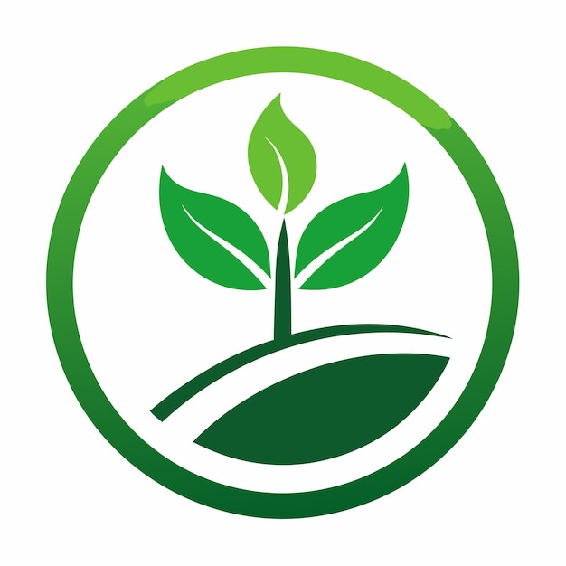
The visual language of sustainability
Eco-friendly farming logos consistently employ certain visual elements to communicate their message. Color palettes lean heavily towards earth tones – greens, browns, and blues – evoking images of nature and freshness. These colors convey a sense of health, growth, and environmental responsibility. You’ll rarely see harsh, artificial colors in these designs.
Fonts matter too. Hand-drawn lettering feels real and connected to the dirt. It's a sharp contrast to the cold, corporate look of standard sans-serifs you see on tech logos.
Imagery is carefully considered. Leaves, water droplets, animals, and stylized landscapes are common, but designers are increasingly aware of avoiding clichés. The goal is to create imagery that feels fresh, authentic, and specific to the farm’s unique practices. Too much reliance on generic imagery can dilute the message.
Shapes also contribute to the overall effect. Circular designs, representing cycles of nature and sustainability, are frequently used. Natural forms – flowing lines, organic shapes – are preferred over rigid, geometric structures. At Foresight Creative, we’ve seen how thoughtfully chosen design elements can dramatically enhance a farm’s brand identity.
- Earth tones like deep greens and soil browns replace artificial neon colors.
- Typography: Organic, hand-drawn fonts; avoiding sterile sans-serifs
- Imagery: Leaves, water droplets, animals, landscapes (avoiding clichés)
- Shapes: Circular designs, natural forms
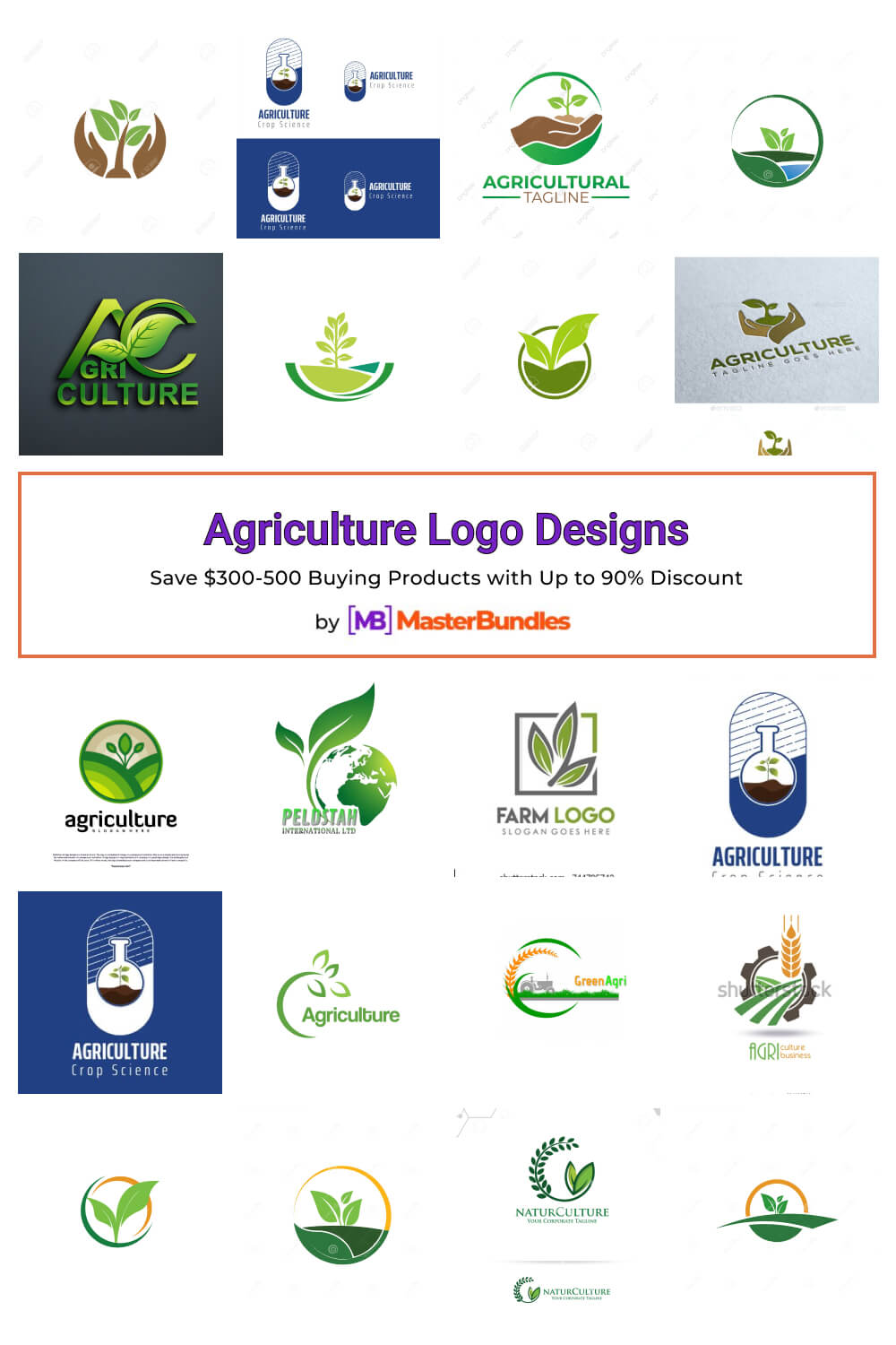
Sustainable Farming Logo Examples
- Happy Dirt Farm (Washington State) - This logo utilizes a hand-drawn illustrative style, depicting a smiling root vegetable. The earthy tones and organic shape immediately convey a sense of natural goodness and healthy soil practices. It's effective because it's approachable and memorable.
- Six Row Brewing Company (Massachusetts) - While a brewery, Six Row actively sources ingredients from their own farm. Their logo features a simple, minimalist wheat stalk illustration within a circular frame. The limited color palette and clean lines communicate a focus on quality and natural ingredients.
- Full Belly Farm (California) - Full Belly Farm's logo employs a vintage aesthetic with a detailed illustration of a bountiful harvest scene. The use of warm colors and a slightly distressed texture evokes a sense of tradition and established farming practices, while emphasizing abundance.
- Stone Hollow Farm (Kentucky) - Stone Hollow’s logo is a minimalist design featuring a stylized stone and leaf. The muted green and gray color scheme reinforces a connection to the land and natural processes. Its simplicity makes it versatile for various applications.
- Red Hen Farm (New York) - This logo features a charming, illustrative red hen perched atop a basket of produce. The hand-drawn style and vibrant colors create a friendly and inviting image, suggesting a focus on fresh, locally-sourced eggs and vegetables.
- Singing Frogs Farm (California) - Singing Frogs Farm uses a minimalist logo with a simple frog silhouette integrated with a leaf. The green and brown color scheme is directly related to nature and sustainability, and the overall design is clean and modern.
Industry Breakdown: Logos for Different Farms
The ideal logo design varies significantly depending on the type of farm. An organic vegetable farm might emphasize freshness and vibrancy with bright greens and illustrations of ripe produce. Their logo aims to convey a sense of health and abundance.
Regenerative agriculture operations, focused on soil health and biodiversity, often incorporate imagery of roots, soil, and interconnected ecosystems. Their logos communicate a commitment to long-term sustainability and ecological restoration. It’s a more complex message than simply "organic".
Dairy farms emphasizing pasture-raised cows require a different approach. Logos often feature happy cows grazing in lush pastures, conveying a sense of animal welfare and natural farming practices. Transparency about animal conditions is key for these brands.
Orchards and vineyards might focus on the beauty of the fruit trees or the rolling hills of the landscape. Logos often evoke a sense of tradition, craftsmanship, and the unique terroir of the region. The emphasis is often on quality and heritage.
Even tech-driven vertical farms – a relatively new sector – require thoughtful branding. Their logos might emphasize innovation, efficiency, and controlled-environment agriculture. Clean lines and modern typography are common, highlighting the technological aspect of their operation.
Minimalism vs. Detail: Finding the Right Balance
There’s a constant tension between minimalist and detailed logo designs. Minimalism – clean lines, simple shapes, and limited color palettes – offers memorability and versatility. A minimalist logo is easily recognizable and works well across various platforms. It’s often a good choice for farms wanting to project a modern, sophisticated image.
However, more detailed, illustrative designs can be incredibly evocative. They allow for a richer storytelling experience and can convey a greater sense of the farm’s personality. This approach is particularly effective for farms with a strong heritage or a unique farming practice.
The key is finding the right balance. "Sustainable’ doesn’t automatically equate to ‘rustic’ or ‘complex". A minimalist logo can be just as effective at communicating a commitment to sustainability as a highly detailed one. It depends on the overall brand strategy and target audience.
I believe the best approach is to prioritize clarity and simplicity. Even if a logo incorporates some illustrative elements, it should remain easily recognizable and memorable. Overly cluttered designs can be confusing and dilute the message.
- Minimalist designs use clean lines and simple shapes to stay memorable on small labels.
- Detail: Evocative, storytelling, personality, heritage
What to look for in 2026
Looking ahead to 2026, we can anticipate several emerging trends in sustainable farming logo design. The use of animated logos – subtle movements or transitions – could become more prevalent, adding a dynamic element to the brand identity.
Augmented reality is a possibility, but I doubt it will take off soon. Scanning a logo to see a farm's history is technically possible, but it's too expensive and clunky for most small operations to bother with.
More likely is the development of dynamic logos that change based on seasonal availability or farm conditions. A logo might subtly shift colors or imagery to reflect the current harvest or the weather conditions. This adds a layer of authenticity and transparency.
The increasing use of blockchain technology and traceability in agriculture will also impact branding. Logos might incorporate elements that signify verified sustainability claims or provide consumers with access to detailed information about the product’s origin and production process. This is about building trust through transparency.
- Animated logos
- Augmented reality elements
- Dynamic logos (seasonal/condition-based)
- Blockchain integration for traceability

No comments yet. Be the first to share your thoughts!